When I started making interactive diagrams the hard part was making them interactive. But over the years I've gotten much better at that. Now the problem is designing the diagrams. Here's an example of how I created many variants of this diagram.
- #1 I started with the top left, solid circle off. It shows all the radii so you can see that it doesn't matter which you pick.
- #2 Then I removed all the radii because it felt too busy.
- #3 I added one of each radius back in, and moved the labels next to the radius line.
- #4 Following a suggestion on Twitter, I made the lines orthogonal. A little trickier to toggle flat/pointy.
- #5 I also tried putting the arrows pointing right and up (seemed nicer than pointing left)
- #5 I tried the measure line being faint solid instead of bold dashed
- #6 I tried putting the diameters next to each other for easier comparison
- #6 I tried an equilateral triangle which lets you derive how the two lengths are related
- I tried replacing the dashed circles with solid circles ()
- I tried showing all the points vs only some of the points ()
- I tried thinner/thicker lines in places ()
- I tried using gray instead of blue, because my other diagrams don't use blue ()
Scott Jenson made several versions:
- https://twitter.com/scottjenson/status/1587208998863847424[1] - "Tried to remove as much detail as possible and create a visual relation between the diameter/radius terms"
- https://twitter.com/scottjenson/status/1587213069188374529[2] - "this is such a delightful mini-problem and it's raising so many interesting directions"
- https://twitter.com/scottjenson/status/1587876123865538560[3] - "This is NOT what you want, it's more of a provocation, trying a few things out: a. remove points b. focus on the visual relationship b/w rad vs diam This loses your equilateral triangle, but, is that critical?"
- https://twitter.com/scottjenson/status/1588382448190074880[4] - "So many delightful constraints to tweak"
Minor variations: sometimes labels can be above or below a line; the dashed measure lines could be slightly longer or shorter.
But how can I evaluate these designs without knowing the purpose of this diagram?
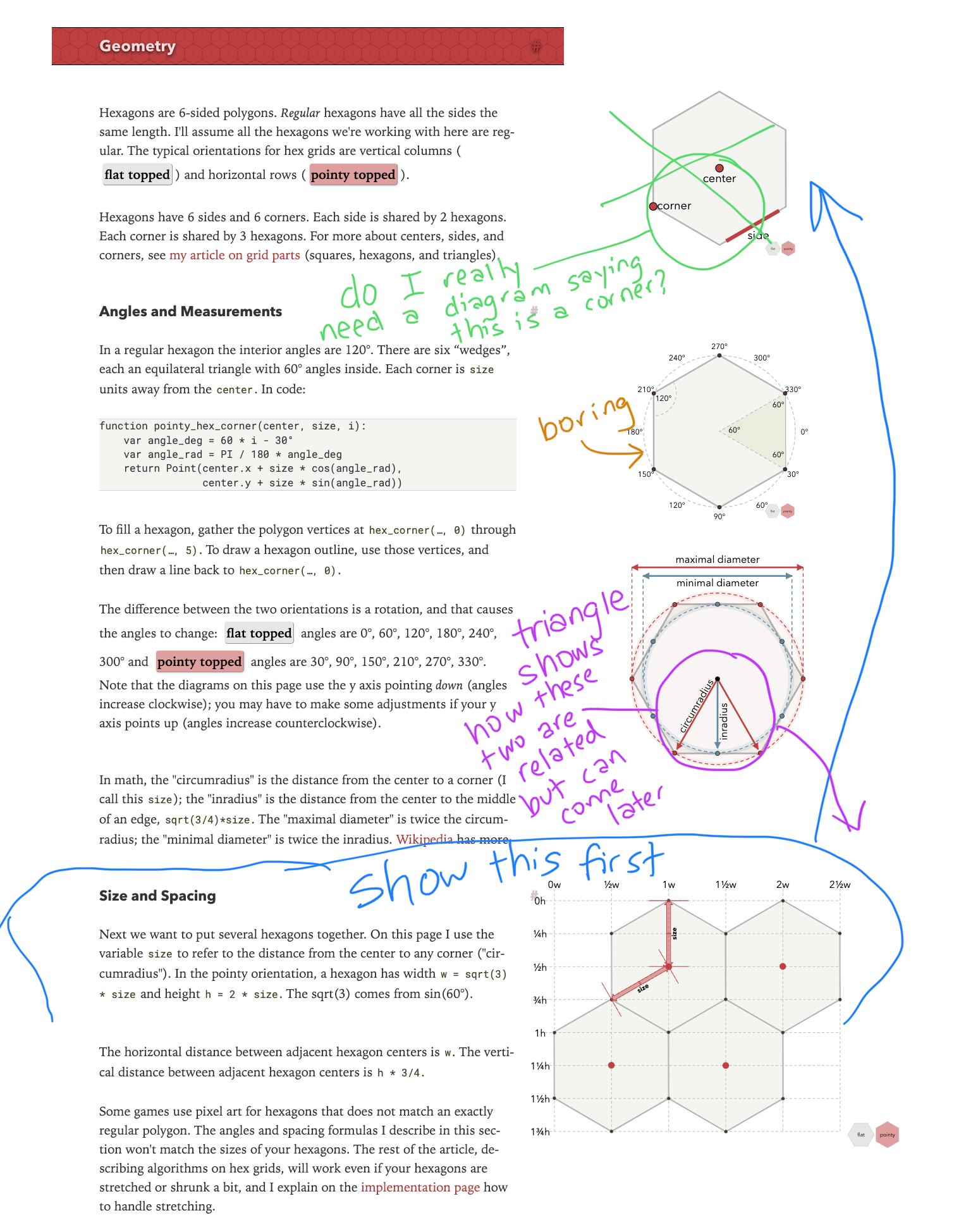
This diagram fits in between the "math" part of the page and the "size and spacing" part of the page. The link to the math part is that I'm using the math terminology here. But the purpose is to link the math to the practical considerations of a hexagon grid. You want to know the width, height, horizontal-spacing, and vertical-spacing. Those values are derived from the four measurements in the new diagram.
With that in mind, I made a list of pros/cons of each diagram design:
- the extra spokes aren't needed for the width/height/etc.
- the angled labels don't match the width/height needs
- again, angled labels don't match the needs
- this is my top pick as the diameter labels do match the width/height, but pointy/flat rotation is funky
- the arrows are easier to read than in #4 but the diameters aren't useful, and pointy/flat rotation is funky
- only one diameter is useful here, but the triangle shows how the width/height are linked, but I don't have a flat version
Of #4 and #5, I like the radius arrows going up and right like #5 pointy top (up and right are both "positive" connotation). And then I like the diameter labels on left and bottom like #5 pointy top or #4 flat top, as it gives some distance away from the radius labels. But I also want the minimal and maximal diameters to be on the axes like #4 not #5. Yes, the radius labels are harder to read that way, but I think being able to link these diameters to width and height is more important.
Implementing the proper pointy/flat rotation is harder with #4, #5, #6 and it's not fully implemented above.
I do like the equilateral triangle in #6 showing how the two radii are connected, but it doesn't fit in with the bigger goal of showing width and height.
So I was thinking I should pick a hybrid between #4 and #5, with the solid circle style not the dotted circle style. And I will either implement a trickier pointy/flat toggle, or I will make one diagram for each. Right now the radius, diameter, and labels are linked and I rotate them as a group, so I have two rotation groups. To implement this the way I want, I will need six different rotation groups (radius+label, diameter line + measure lines, and diameter label).
1 Rethinking this#
But a good night of sleep changes my perspective and I realized after all of this that it's the entire section of the page I don't like.
The most important diagram here is the size/spacing diagram at the bottom. I want to put it at the top. But that diagram has issues. It serves two purposes. One is the width/height of a hexagon. The other is the spacing of a hexagon in a grid. The problem is that the diagram doesn’t show both at once. Instead, you have to hover over text of the page (not something you’d ever discover) to see the diagram switch between modes. Even worse, it shows neither mode when you load the page.
I wrote the rest of this up in these blog posts: