My blog from 2003 to 2023 was simblob.blogspot.com but from 2024 onwards it is here.
Academic citations
Although my site isn’t designed to fit into the academic world, occasionally an academic paper will cite one of my pages. Everyone uses a different format. That got me wondering if there are is a proper way to cite a web article. The first place I checked was Distill.pub. It’s a site I greatly admire, and it’s also a real journal with amazing people. They would’ve given a lot of thought to this. At the bottom of each article they give both a text citation format and a BibTeX format:
For attribution in academic contexts, please cite this work as

Carter & Nielsen, "Using Artificial Intelligence to Augment Human Intelligence", Distill, 2017.

BibTeX citation

@article{carter2017using,
  author = {Carter, Shan and Nielsen, Michael},
  title = {Using Artificial Intelligence to Augment Human Intelligence},
  journal = {Distill},
  year = {2017},
  note = {<https://distill.pub/2017/aia>},
  doi = {10.23915/distill.00009}
}
Should I do something similar?
Highlighting interactive code blocks
I have sample code on some of my pages. I try to use syntax highlighting when I can, but I don’t use it everywhere. In particular, Hexagons guide and Terrain from Noise don’t have syntax highlighting. Why?


Optimizing page size
When I started my web site, we didn’t have static site generators or WordPress or GitHub Pages or much else. People wrote HTML1 by hand. Over the years, I’ve built my own setup to manage my site. My current setup involves writing XHTML that gets transformed into HTML using XSLT.

My XSLT template and CSS styling are global. They apply to the more than 30 years of pages I’ve written. That means whenever I change the XSLT or CSS, I need to make sure the change works for the entire site, over 800 articles. Until now I’ve been doing that manually by spot checking the popular articles.
While working on my SDF font guide, I noticed an issue with the white space. There were some spaces missing. It’s easy to work around, so I did — I added in a few places. This has been a problem for a while and I just work around it each time. After I finished the project, I decided to dig into the root cause.
Writing a guide to SDF fonts
(TL;DR: this is a blog post about the process of writing my guide to SDF fonts.)
Back in 2024 I learned about SDF (signed distance field) rendering of fonts. I was trying to implement outlines and shadows in a single pass instead of drawing over the text multiple times in different styles. I intended to use these fonts for two different projects, a game and a map generator. I got things working but didn’t fully understand why certain things worked or didn’t work. I wrote some notes on my site about what I tried. In the end, I stopped working on both the game’s fonts and the map generator, so I put all of this on hold.

Fast forward to late 2025, and my incomplete notes sometimes show up on the first page of search results for “sdf fonts”! Surely that isn’t the best page on the topic. It would be better to point to library documentation or maybe one of the research papers about the topic. My page isn’t that good.
Initially my thought was “search engines are in their decline” but then I decided “this is an opportunity”. I decided to make a page worthy of being the top search result.
URLs with trailing punctuation
When a url is posted on a forum/chat, it’s often automatically made linkable. But sometimes the regexp that grabs the url also grabs a trailing punctuation mark. For example, if the text is “visit red blob (https://www.redblobgames.com) and scroll to the bottom” and regexp picks up the trailing parenthesis, it will make “https://www.redblobgames.com)” clickable. When you click on this, it will request GET /) which will be a 404 error.
I don’t get a lot of these in my server error logs but it’s easy to do something about it.
What I did in 2025
It’s time for my annual self review. In last year’s review I said I wanted to spend time learning things for myself, and less time writing for other people. The main themes for 2025 were:
- playing with text (very broadly)
- playing with maps (specifically mapgen4)
- improving my web site
Outside of Red Blob Games work, I had two goals: improve my health and improve my quality of life. So how did the year go? I think it went well.
Since I have forgotten everything I did, I went through my Notion page and my git logs:
for git in $(find . -name .git)
do
    dir=$(dirname "$git")
    cd "$dir"
    echo ___ "$dir"
    git --no-pager log --since=2025-01-01 --pretty=format:"%as %s%d%n"
    cd - >/dev/null
done
Goodbye Sass
My “site” is spread across five different servers. I use slightly different CSS on each one. Since 2013 I’ve been using Sass (SCSS) to manage the variants, using these features:
- Variables → available in CSS since 2020
- Calculations → available in CSS since 2015
- Nesting → available in CSS since late 2023
Even though I want to use new browser features right away, I usually wait a year or two for them to stabilize and get into extended support releases.
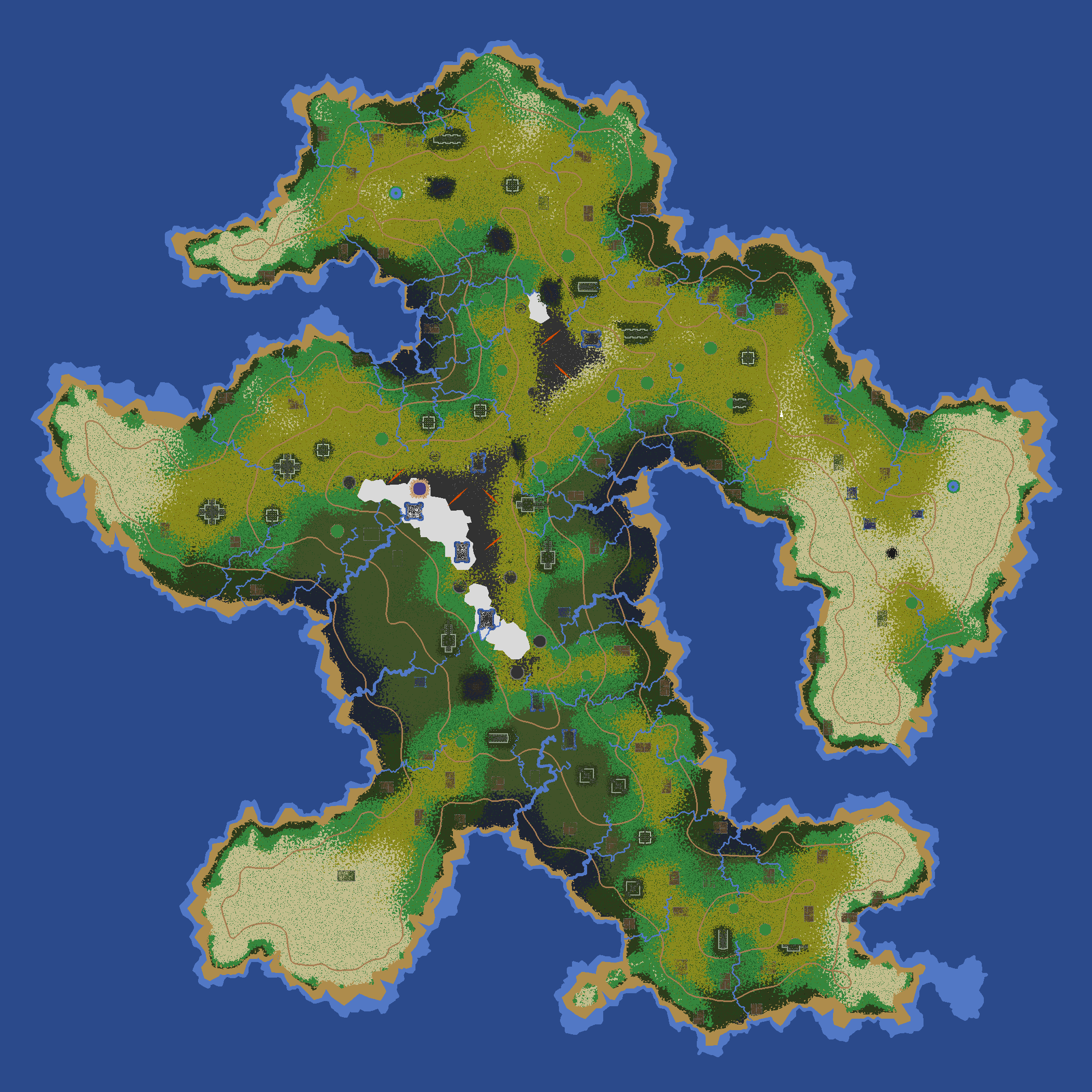
RotMG map seeds
I had just wrapped up a project and wanted to do something small/fun before I started the next one. The Flash runtime is being reimplemented in Rust, and I’ve enjoyed re-enabling the Flash on my site. That had me thinking about my Flash projects again. I decided to try to revisit an unsolved mystery from one of my Flash projects.
Back in 2010, I wrote an article about procedurally generating wilderness maps using Voronoi polygons, and I made a demo in Flash. The authors of Realm of the Mad God used it to generate thirteen maps that shipped with the game. The authors don’t remember the map seeds they put into the map generator. These maps were used from 2010 to 2024.
I’ve been curious what the map seeds were.
I told myself at the time that it would be a pain to recover the seeds. There are 232 = 4 billion map seeds. It took 5 seconds to generate each map. That’d take 20 billion seconds, or around 630 years, to generate all the maps, each with 222 = 4 million tiles.
But with some optimizations and shortcuts … I found a match!

Mapgen4’s use of WebGL2
I try to avoid big software rewrites. But sometimes the rewrites are just an excuse to re-familiarize myself with the code. I rationalized rewriting Mapgen4’s renderer by saying I wanted to use WebGL2. And I did use WebGL2, but the improvements turned out to be minor:
- Vertex Array Objects to simplify and speed up code — but OES_vertex_array_object makes this available in WebGL1 (good support on all platforms)
-
gl_VertexIDto simplify and speed up code — only available in WebGL2 -
R16Ftexture format for elevation and depth — needing EXT_color_buffer_half_float in WebGL1 (poor support on Android) or EXT_color_buffer_float in WebGL2 (good support on all platforms) - Linear filtering of elevation and depth — needing the
R16Fformat first -
SRGB8texture format for linear rgb color handling — supported in WebGL2, but could be emulated in WebGL1
I did not need to switch to WebGL2 for features, but implementing those features would make the code more complex and error prone. I decided to switch to WebGL2 so that I could simplify my code.
The Vertex Array Objects and gl_VertexID didn’t change the rendering output, but the texture format did, both good and bad, and I wanted to share some screenshots.
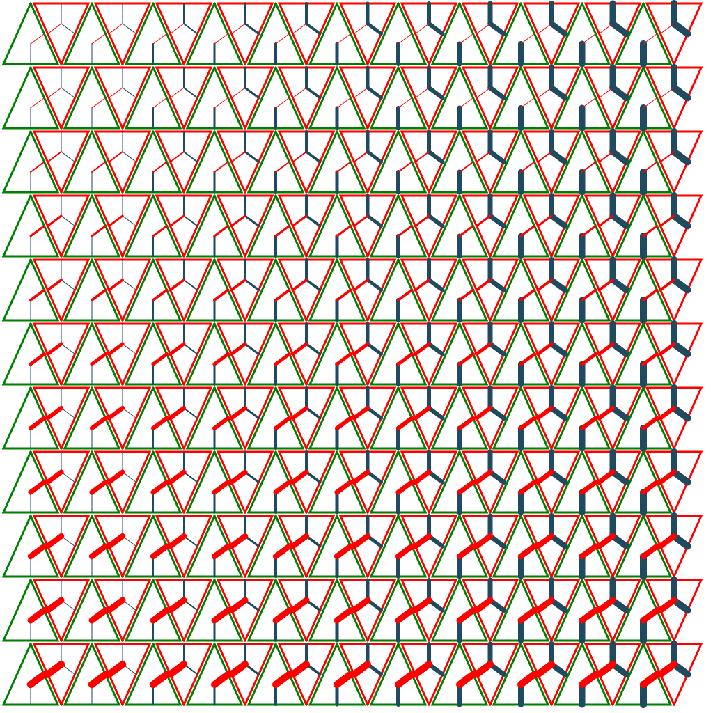
Mapgen4 river shader
Back in 2018 I had the idea to prerender short segments of river bends and confluences into a texture, and then use that texture to draw the rivers to the screen. I was trying to have draw exactly one triangle per Delaunay triangle, so that I could generate the geometry ahead of time and only change the texture coordinates. I planned to implement this as a 2D table:
Mapgen4 renderer
It’s been a while since I’ve worked on mapgen4 features. In 2018 I declared it finished. I then put it away and worked on other projects. Over the years I have updated the code (es6 modules, typescript, pointer events, boundary points, pnpm) without adding any features. I had been leaving all feature updates for a future map generator.
Last year I decided it was time to start thinking about new features. I started experimenting with some prototypes. That made me realize there are many improvements I’d like to make to mapgen4 before getting into big features.

Harnessing ChatGPT hallucinations
The web server I use (nginx) logs errors to a file. I check this occasionally to make sure nothing’s going wrong with my server. I typically get these kinds of 404 requests:
- typos
- the url /pathfinding/a-star/inroduction.html was meant to be
/pathfinding/a-star/introduction.html - parsing errors
- the url /articles/visibility/)and was some text
/articles/visibility/) andthat went through a url regexp - misconfigured crawlers
- the url /region-graph-path.png was originally from html
<img src="region-graph-path.png" …>but the crawler tried fetching it from the top level instead of the subfolder - attackers
- the url /FCKeditor/editor/filemanager/connectors/asp/connector.asp?Command=FileUpload&Type=File&CurrentFolder=%2F is some crawler looking for weaknesses in my web site
Last week I noticed a request for /articles/autotiles/ with the HTTP Referer chatgpt.com. This is an unusual request. It’s not syntactic like the above. It’s a semantic error. An AI confabulation/hallucination probably. The referrer means that the user was on chatgpt.com and clicked a link to https://www.redblobgames.com/articles/autotiles/, which is a 404 error.
I decided to investigate more.
Let’s write a search engine, part 2 of 2
Last time we implemented a search feature that found all matching documents, sorted in some arbitrary order. This time I want to sort them in a more reasonable order. Here are some ideas, some which depend on the query and others which don’t:
- popular pages first
- newer (or older) pages first
- promote (or demote) certain folders manually
- promote (or demote) based on the type of content in the page
- pages that have more occurrences of the query string
- pages where the query matches are spread out (or concentrated)
- pages that have the query string in titles or headings
I’m going to try building this:

Let’s write a search engine, part 1 of 2
I have a search box on my web site that uses Google to search my site only using the site: operator. Try it — type in hexagon tiles and you’ll see that it shows my hexagon tile page.
I wondered though: what would it take to make my own search feature that worked as you typed? This is what I’ll implement:

I also wondered if there are other things I might want to build with this data, like Simon Willison’s “related pages” feature. Or browsing by category. Or browsing by date.
Hexagon conversions
My hexagon guide has many conversion routines — axial to cube, cube to offset, hex to pixel, etc. Sometimes these steps can be combined into larger steps or separated into smaller steps. There’s a balancing act between:
- give the reader the final answer
- give the reader the ingredients so they can adapt them as needed
My original goal was to provide code for these 22 conversions:

Mapgen4 trade routes
Last time I talked about de-optimizing mapgen4 so that I could more easily create experiments. I wanted to share one of those experiments. I recently assembled some of my existing ingredients into something that was just plain fun to watch, and I wanted to share this simulation of traders moving around a map:

De-optimizing mapgen4
Lately I’ve been experimenting with map algorithms. I have three starting points:
| Generator | Elevation | Biomes | Rivers | Editable? |
|---|---|---|---|---|
| mapgen1 | noise | noise | down | no |
| mapgen2 | distance field | distance field | down | no |
| mapgen4 | noise | simulation | up | yes |
(What happened to mapgen3? It was a failure. I had tried to change the programming language, data structures, and algorithms at the same time. I had better luck changing one thing at a time.)
I’d prefer to use mapgen4 for my experiments. But it’s hard.
Hexagon spiral coordinates
My guide to hexagonal grids is one of the most popular pages on my site. I keep a list of things I want to add to that page. One of them has been spiral coordinate systems. I had thought I would wait until I actually use them in a real project, so that I would have real world experience with the thing I’m writing about. I’m afraid of writing about things I’m unsure about, or information that’s incomplete. But I haven’t used them yet.
I decided to stop waiting.

Thoughts on Flash
I know a lot of people hated the Flash Player web plugin, but I found it to be quite useful for my experiments. It gave me vector graphics in the browser so that I could share demos without asking people to download an executable from me. And it ran long before SVG / HTML5 was widely available in browsers. I had been porting some of my old Flash code to Javascript, but that takes time that I could be instead spending on new projects. So I’m glad to see that the Ruffle Flash emulator has made so much progress on ActionScript 3:

What I did in 2024
It’s time for my annual self review. In last year’s review I said I wanted to improve my site:
- fix broken links
- organize with tags
- improve search
- post to my site instead of to social media
- move project tracking to my own site
I didn’t have any specific goals for writing articles or topics to learn. So what did I do? The biggest thing is that I’m blogging more than in recent years:

Hexagon page animations
When I first wrote my hexagon guide in 2013 I used d3.js, which has a nice animation system. I had some trouble with CSS transitions in SVG back then, so I was using Javascript transitions using SVG attributes instead of CSS. This looked something like:
d3.select(".grid")
  .transition()
  .attr("transform", "rotate(30)");
That would rotate the grid from flat-topped to pointy-topped, but the text would be rotated too:

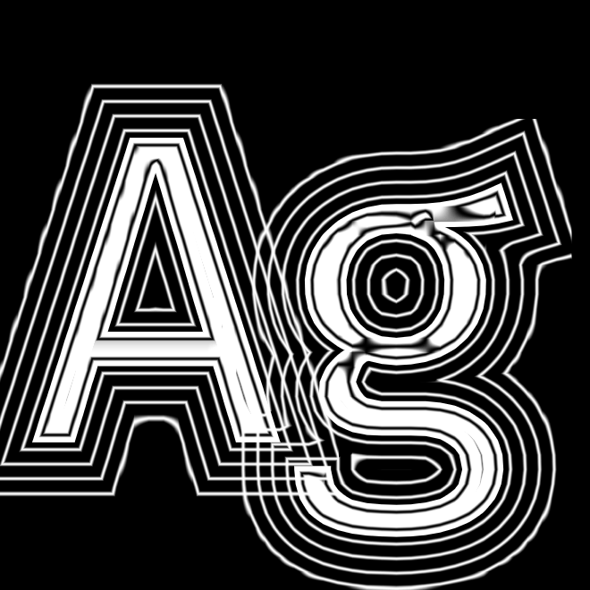
SDF Halos
I had previously posted about drawing outlines around fonts. The goal is to make labels easier to read in situations like these:

Especially where the text and background are the same lightness, an outline with the inverse lightness can make it more readable:

These outlines are called “halos” in the cartography world. There are many styles one can use. A solid outline is the simplest thing to implement, so I started with that. Apple Maps and Google Maps use a solid outline too. However, a solid color outline can be distracting, and Cartographer Tom Patterson instead uses background blurring with feathering (variable strength) to produce nicer looking halos. That article made me want to try other styles.
SDF headless tests, part 2
In the last blog post I wrote about how I wanted to test the parameters of msdfgen, which generates multi-signed distance fields for fonts and other shapes. While testing the emrange parameter, I found lots of bugs in my renderer.
I also wanted to try out msdfgen’s new asymmetric range parameter, aemrange. The distance field goes both inside and outside the font edge, but if I want outlines, I want it to go pretty far outside the font. I made a visualization to show the range:

From this we can see that the interior has far fewer contour lines than the exterior. That’s because fonts are relatively thin. If it were a large object like a solid circle, it would have many contour lines on the interior.
SDF headless tests, part 1
In the last few posts I have shown some of the experiments I did with font rendering. Those experiments were all in the renderer. I’m using msdfgen-atlas to generate the textures used by the renderer, and I wanted to experiment with msdfgen’s parameters. Instead of generating new font data and then reloading the browser, I decided to try “headless” rendering controlled by a shell script.
SDF curved text
Over the last few posts I wrote about things I did to improve font quality, such as antialiasing and combining distance fields to merge outlines and halos. But I want to “pop up the stack” a bit and talk about one of the bigger goals for this project. I want to render text in styles that I’ve seen in maps, both online and offline, both fantasy and real. In particular, I want to apply spacing, rotation, and curvature to the labels.

SDF combining distance fields
Learning about font rendering, I was looking at text closely last time, and I noticed another issue. The shadows of each letter overlap the previous letter. That’s because I’m drawing one letter at a time. So for example in the fl, I draw the f’s letter, outline, and shadow, then I draw l’s letter, outline, and shadow. So l’s shadow is drawn on top of f’s letter.
SDF antialiasing
Last time I was looking at letter spacing with my renderer to see how it compared to Google Chrome on Mac. But while doing that I noticed that their antialiasing looked nicer than mine. So I tweaked parameters, including antialias edge width, gamma, and threshold bias.


SDF letter spacing
My summer project is to work on labels for maps. In the previous post I described how I created outlines, and how I had a bug in the rendering. While looking closely at text to fix that bug, I noticed in one of my tests that the k and s seemed too close together. The h and e seemed a little too far apart.
SDF font outlines
In the previous post I introduced my summer project, to render labels on maps. As part of this, I want to be able to draw outlines, halos, and drop shadows. Signed distance field fonts are well suited for this. The basic use is to consider the signed distances -1 to 0 to be “inside” (filled) and signed distances 0 to +1 to be “outside” (transparent).

To draw an outline, we can add another range, maybe 0.0 to +0.2:

Labels on Maps
My friend L recently mentioned that he hadn’t seen any blog posts from me. It’s true, I haven’t posted for a while. Earlier this year I had explored signed distance field fonts, in particular using Viktor Chlumský’s multi-channel distance fields. I really enjoyed the many experiments I did, and I learned a lot. I had intended to use it in a real game project but the timing wasn’t right. So I put it away. Then before I got started on a new project, life happened. I had to take a break and attend to other things. I haven’t been blogging because I haven’t had projects to blog about.
Then in July I started thinking about other places I could apply the font code. I thought back to my 2019 blog post about map annotations, where I observed that even small amounts of text added to a procedurally generated map could make the map much more interesting. I started dreaming up a new map generator. Broadly, the tasks would be along these four categories:
- Procedurally generate a map that has interesting “point” features including chasms, volcanos, waterfalls, and towns.
- Identify large scale “area” features on a map such as peninsulas, bays, and mountain ranges.
- Generate names for both point and area features, tied into geography, history, cultures, etc.
- Place labels on the map corresponding to these features.
Font Distortion
I had previously blogged about text effects, and how I accidentally discovered that I could alter the personality of the font by rendering a distorted shape. At the time, I was focused on text effects and didn’t want to get distracted by this discovery. So I wrote it down for later.
Well, later came, and I decided to explore it:
Work in progress: heuristics
I have several pages that are unfinished because I can’t find an explanation I’m happy with. Sometimes while trying to come up with an explanation, I realize I don’t actually understand the topic as well as I thought! One of these topics is heuristics for the A* algorithm.While trying to understand the topic better, I came up with this example:


Flow field pathfinding
You may know me for my interactive tutorials. But before that, I was writing visual but non-interactive tutorials. In particular, there wasn’t a lot of information about A* on the web, so I decided to collect all my notes about pathfinding together in one place in the 1990s. But then in the 2010s I started making interactive pages. The newer pages are narrower in scope; I covered a broader set of topics on the older pages. I maintain both sets now.
Over the years people have asked me about “flow field pathfinding”. I felt like the early papers about it conflated the flow fields with hierarchical pathfinding, but I wasn’t sure, and I didn’t want to write about it until I was sure.
Draggable examples
On my pages I often want to be able to move an object around in a diagram using the mouse or touch. Last year I spent some time learning about browser mouse+touch events, and wrote a page about event handlers for dragging objects around. I hadn’t realized it at the time, but it was only half the solution.

Testing font code
Earlier this year I was trying to improve font rendering in some of my C++ projects, and that led me down a rabbit hole of learning signed distance field (SDF) font rendering. I wanted to try out the SDF fonts in a real project. I occasionally help with Galactic Assault Squad (GAS), especially “engine” code, so for Week 6 I decided to try SDF fonts there.
Text effects
In Week 4 of the year, I tried out various ways of using distances in signed distance field fonts. In Week 5 I wanted to do something different. I decided to explore what I could do treating each character as its own sprite and then applying sprite antimation. The week turned out to be fun but I didn’t learn as much as I hoped I would. To start, I copied the code from the previous week so that I would have a working program right away. Then I removed things I didn’t care about this week and added new code. This is like forking a project but for my weekly experiments I tend to copy the code instead of forking.
During the initial experiments I made an interesting discovery:

This is an ordinary font made more interesting by using a non-rectangular sprite.
Distance field effects
In the last post I described how I fell into the font rendering rabbit hole. I try to put some time limits on each topic — otherwise I would explore forever! I try to pick a theme each week:
- Week 3 was the basics: SDF, MSDF, atlas, shader
- Week 4 was effects on individual glyphs: outlines, shadows, glow, bevel
- Week 5 was effects on how glyphs move: sink, rise, bold, slant, rotate, wavy, bounce, warp
The key idea I wanted to explore this week is that a distance field font can be thought of as contour lines:
When rendering a font normally like I did last week, I considered distance < 0 ? "white" : "transparent". But there are so many more things to do with this distance!
Signed Distance Field Fonts
Each week I pick one or two things to work on. In week 2 of this year, I decided I should update my “hello world” OpenGL+Emscripten code from 2015. It’s boilerplate I use occasionally in other projects. It wasn’t compiling anymore, and I wanted to fix that as well as several other things.
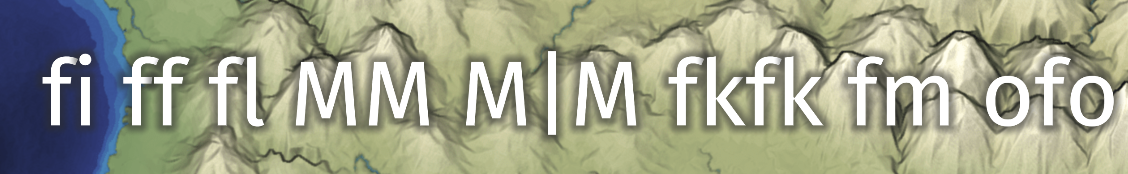
One of the unsolved issues in that starter code was that the fonts never looked good. I was using the stb_truetype library, and got this output:

Look at how H and e are too far apart, and S and D are too close together. I tried various things but couldn’t figure it out, so I had two workarounds at the time:
- Use Omar Cornut’s Dear ImGui, which has nice looking font rendering.
- Use a monospace font to hide the spacing problems.
New Blog for 2024
For some time now I’ve been unhappy with how much more friction there is when posting to my blog than posting to twitter. I keep wanting to blog more but I don’t. Part of the problem is content. I did blog more in 2018, when I was working on projects that had more to share. Part of the problem is expectations. On Twitter it’s expected that I write very little (280 character limit, up to 4 images or 1 animation). That constraint makes it easier to post. On my blog I tend to write longer more involved posts. But part of the problem is the process. My posts on Twitter take a lot less effort than my posts on Blogger. The Blogger UI got a lot worse in 2020, but it was already inconvenient for me.
So I’ve been thinking about what I actually want, and what I want isn’t Twitter or Blogger. I want something much closer to Hugo or Jekyll — a static site generator. I want to be able to save a file and have it become a blog post. I want to be able to grep over my existing files. I want to be able to write a perl script to fix something across pages. I decided a goal in 2024 is to switch from Blogspot to a static site generator.