(Warning: these notes are rough – the main page is here and these are some notes I wrote for a few colleagues and then I kept adding to it until it became a longer page)
Several people have asked me how I make the diagrams on my tutorials.
I need to learn the algorithm and data structures I want to demonstrate. Sometimes I already know them. Sometimes I know nothing about them. It varies a lot. It can take 1 to 5 months to make a tutorial. It’s slow, but the more I make, the faster I am getting.
I need to figure out what I want to show. I start with what’s in the algorithm itself: inputs, outputs, internal variables. With A*, the input is (start, goal, graph), the output is (parent pointers, distances), and the internal variables are (open set, closed set, parent pointers, distances, current node, neighbors, child node). I’m looking for the main idea to visualize. With A* it’s the frontier, which is the open set. Sometimes the thing I want to visualize is one of the algorithm’s internal variables, but not always.
I then sketch out the page structure. What can I start with? Usually I want to start with a description and demo of the problem to be solved. After that, I can start with the basics and build up (probability[1], A* pages[2], noise[3]) or I can start with an obvious answer and then improve upon it (curved roads[4], visibility[5]). Sometimes it’s a mix of both (hexagons[6]).
I then need to build the visualizations. I usually use d3.js. I think of d3 as a visualization construction kit. It doesn’t have the visualizations I want. Instead it gives me the tools I need to build a set of visualizations. For the A* page I wanted to build a set of pathfinding visualizations. I typically build a tiny library for each project. I ask myself, what are the different things I want to demonstrate? This page has several different search algorithms, several different output layers, and several side-by-side comparisons. I need the visualization to connect to one of many algorithms. I need it to let me choose what layers to show. I need to be able to put two or more diagrams side by side that share some data. I designed a diagram class that let me do all that.
Actually that last part is not true. It’s not true at all.
What really happens is nowhere near that clean! (see note at end of page)
It’s more of a wibbly wobbly timey wimey mess. I take a stab at something, then learn from it, then add hack upon hack until it works, or it becomes too unwieldy and I come with a better approach. I do a lot on paper. I go on nature walks. I sleep on ideas. It’s not structured at all, which might be why it takes so long.
For the A* page, I ended up with a do-everything Diagram class that assembles the input parameters, a search algorithm, an input map, and a list of output layers. It runs the search and then tells each output layer to redraw. All the classes are pretty small and I leave the fields public, and access them from outside the object. It’s “unclean”, but I don’t care. I’m trying to make a beautiful page, not beautiful code.
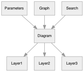
Here are the layers for the diagram at the top of the page:
- Drag and drop the “X” for the goal position (input parameter)
- Drag and drop the “blob” for the start position (input parameter)
- The shortest path (calculated output)
- The polygon map, usually a grid but not necessarily (input parameter)
There’s also an invisible layer for editing the map. It “reaches” into the map layer and adds mouse click handlers to the map polygons.
The code for this looks like this:
var graph = new SquareGrid(40, 20);
var layout = new SquareGridLayout(graph, 15);
var exit = {id: graph.to_id(38, 10)};
var options = new SearchOptions(
    [graph.to_id(7, 11)], null,
    (id, node) => {
        node.h = manhattan_heuristic(graph, exit.id, id);
        return node.cost_so_far + node.h;
    });

var diagram = new Diagram("#diagram_top", graph, options, layout, [
    [BaseLayer],
    [GraphEditorLayer, [1, 2, 3, 8, 20, Infinity]],
    [ReconstructedPathLayer, () => exit.id],
    [DraggableMarkerLayer, 'start', svg_blob(9), options.starts, 0],
    [DraggableMarkerLayer, 'goal', svg_cross(8), exit, 'id']
]);
You can see the list of layers in the call to the Diagram constructor.
When I edit anything (the map or the goal/start position or a slider), I just redraw everything. If it’s a performance problem, I optimize. In this case, redrawing the tiles was slow, so I added an optimization to only redraw a tile if it has changed.
What if I want to share data?
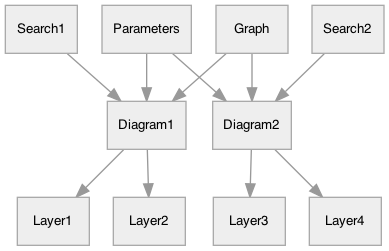
There aren’t that many diagrams, so I just assemble these connections by hand. It’s not worth building an abstraction for approx. 20 diagrams.
Here are the other diagrams on the page (I’m not showing the hidden layers that catch mouse events but don’t actually display anything):
And lots more:
However, I didn’t have these layers in mind when I started.
What really happens is that I don’t know what I want until after I try something. I wasn’t sure how I wanted to explain A*. I suspected that the frontier would be important, so I tried building a visualization of the frontier. I was reasonably happy with it.
Then I realized I wanted to pause, step forward, and step backward. So I looked at the search code and started thinking about how to record its history so that I could have the visualization show every point in the search process. Before I rewrote the code to do that, I timed it. It turned out the search was pretty fast; the visualization took all the time. So I could just re-run search every time. I decided to make the algorithm step forward (easy) but not step back (harder). I rewrote the diagram system.
While writing a later part of the page, I realized I wanted side by side comparisons. I needed to share the map and possibly other data between two diagrams. I rewrote the diagram system again.
This often happens to me. It’s only through the process of writing that I figure out what I want to write, and what my diagram code needs to support that. It means I have to start by doing something without knowing everything beforehand. And it also means I don’t want to invest a lot into the first few versions of the code because it’s likely I’m going to change everything.
I’m not writing this code to be reused or even read by others, so I often don’t invest the time to make it clean. That’s ok with me. I try to follow YAGNI[7]. It’s a messy, explorative process, and so far I haven’t come up with one universal approach that I can use for all the tutorials. Each one gets its own approach, and I occasionally reuse code from one project to the next.
Things I’m thinking about:
- I don’t believe all problems lend themselves to this kind of explanation. What kinds of problems do?
- Should I give out code? pseudocode? just the algorithm? I find that I learn best by implementing the algorithm myself, so I fear that by giving out code, people won’t learn it as well. Plus, it’s less applicable since it’s just one language (and occasionally just one platform).
- I let the reader manipulate the data but not the code. But when I’m implementing the page, I’m manipulating the code, and I feel I understand the problem much better after I work with the code. Am I shortchanging my readers? How would I let them manipulate code? Is it feasible? Is it worthwhile?
- If you think of the set of parameters as forming a parameter space, the reader is exploring the parameter space to see how the algorithm behaves. There are points in that parameter space that are more interesting or educational than other points. How do I guide the reader to those points?
- How do I best adapt the layout for mobile, tablet, desktop, etc.? It’s not just the html/css but I also need the text to match.
- How do I best make diagrams that work with both touch and mouse inputs? Using the default emulated mouse events hasn’t worked well for some of my diagrams.
- Should I be using MathJax and including more math on the pages?
- Should I have a fallback version that doesn’t use javascript? How would that work? That seems to conflict with my goal of making the diagram essential for understanding the page.
- I’m currently writing separate code for the diagrams (which need to be interruptible, expose internal vars, etc.) and the sample code (which needs to be as simple and easy to understand as possible). Is there a way I could share the code? Maybe annotate code in some way and “extract” the simple vs diagram versions?
- How do I write these pages faster? What’s taking the most time?
Note: this page describes the diagrams I implemented in 2014, but I redesigned them in 2020 and this page does not reflect the new design.