I’ve long been intrigued by signed distance fields, especially for font rendering. Valve’s SIGGRAPH 2007 paper[1] was the first I heard of them. A common complaint was that corners end up rounder than they should. In 2016 I bookmarked Viktor Chlumský’s Masters thesis[2] which offers a solution to the corner problem. He posted a summary on stackoverflow[3], and he’s been improving the code[4], with the most recent change being . I decided to play with it!
My motivation: I want something easy. After playing with it, my feeling is: wow, this is much better than I had hoped!
1 Background#
I got into font rendering last week because I was annoyed by the rendering in my “starter” program[5] that I use for emscripten + sdl2 + opengl. I used stb_truetype[6] for that project. But the spacing I got was bad. But I never understood why. So I spent several days digging into my code and also stb_truetype’s code and also other sample code that used stb_truetype. I eventually figured it out! I had been using the API incorrectly.
Unfortunately I didn’t save before & after screenshots. I really should do that!
Along the way I noticed a newer version of stb_truetype supported distance field fonts.
So down the rabbit hole I went.
The rest of this document is notes I made for myself. I tend to keep notes like this, but usually don’t share them. This time I did.
2 Why distance fields?#
From the Valve paper, my understanding is that its benefits compared to a regular font atlas[7] are:
- scaling: render at any size using one texture (doesn’t have to be rendered to different textures per font size)
- texture size: use a small texture to get sharp large text (doesn’t have to be rendered to a large texture first)
- rotation, perspective: can work with transforms (doesn’t have to be rendered to a specific rotation)
But it also has some downsides, mainly rounded corners. Viktor’s masters thesis fixes these
- “the average error of the reconstructed image of the shape is lower by several orders of magnitude”
- “since in some cases it can provide higher quality at a lower distance field resolution, it can allow for reduction of this resolution, bringing an improvement in both quality and performance”
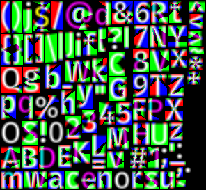
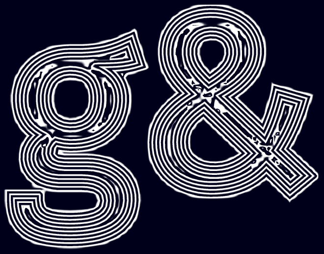
The idea is to use three distance fields to cleverly store the distance to the closest two edges. It ends up producing a texture like this:
It’s pretty amazing how the round dot of the i character ends up 8px tall:
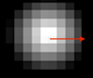
but when rendered measuring the gradient along that arrow, the shader can place a sharp edge. It works at a range of sizes without looking pixellated, like a regular texture font would:
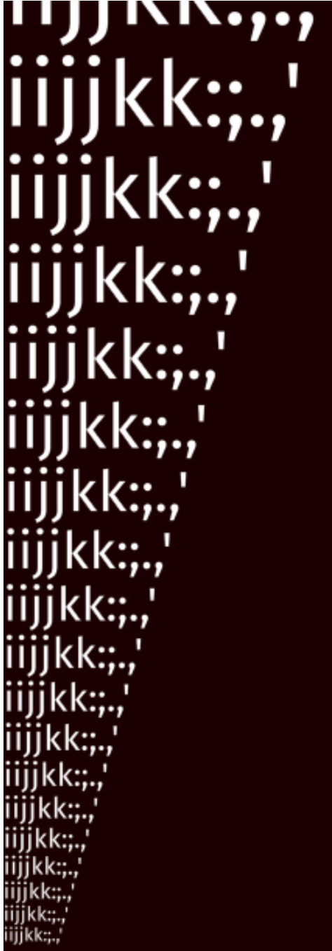
It can be big!

It even seems to work decently even at 20X or 30X the original size!
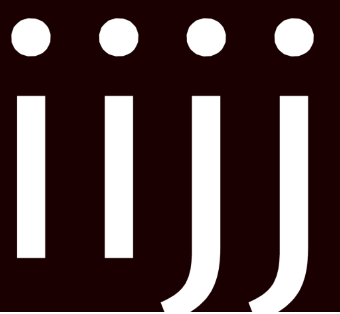
This image shows one of the downsides of distance field fonts. Regular distance field fonts get a little weird where you have two edges come together. Multi distance field fonts work for two edges, but have trouble when three edges come together, like in the k character. Despite that little glitch, I’m very impressed by this technique!
But how does it work? We can think of the distances like contour lines on a map:
To render the font, we fill everything with a higher “elevation” than that contour line. The GPU’s linear texture interpolation will help us figure out exactly what the distance is at any point. The texture only stores values between 0.0 and 1.0 so the areas in the interior of the letter aren’t great (but it doesn’t matter because they are always rendered) and the areas away from the exterior also aren’t great (but it doesn’t matter because they are never rendered).
Distance fields even with three channels still have some downsides, and there are alternatives, but those alternatives are far more complicated. I like distance fields for being “good enough”, with very little code needed.
3 msdfgen#
I first played with msdfgen[8], Viktor’s program for generating a multi-distance-field from a single character or shape.
cd ~/Projects/src
git clone https://github.com/Chlumsky/msdfgen.git
cd msdfgen

brew install cmake vcpkg
export VCPKG_ROOT="$HOME/Projects/src/vcpkg"
git clone https://github.com/microsoft/vcpkg $VCPKG_ROOT

cmake .
make
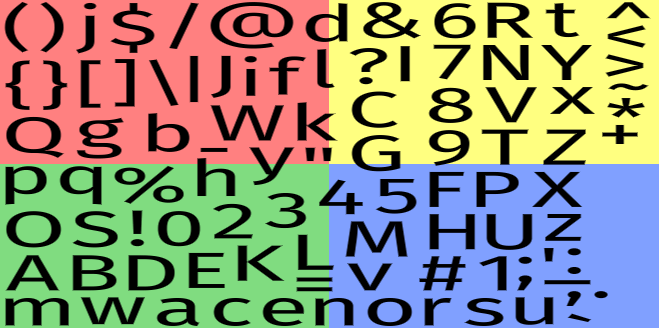
I then ran it for the g character:
./msdfgen -font ~/Library/Fonts/FiraSans-Regular.otf "'g'" -o /tmp/msdf.png -size 24 24 -pxrange 4 -autoframe -testrender /tmp/render.png 1024 1024 -exportshape /tmp/shape.txt
Ok, this is nice! The quality depends on the resolution of the sdf file, of course, and also the complexity of the font. Merriweather (serif) seems to require around 32, while Fira (sans serif) seems to require somewhere between 24 and 28. And also depends on the complexity of the character, e.g. g and Q may be trickier.
I think larger pxrange might be needed for sharper outlines. But until I actually try outlines I won’t be sure. Larger pxrange lowers the quality though, so that’s the tradeoff — to get outlines/glow I need to make the resolution higher.
There is not a built in way to make a font atlas. The -printmetrics flag will print bounds, advance, scale, etc.
This tool also works with SVG files, so that could be useful for distance field rendering of icons.
There’s also a way to output text for the “contours” that make up a shape. It might be possible to use that to generate the distance fields at run time. But that file isn’t saving much over the png, and the png is much simpler, unless I want to combine distance fields in some way at run time. So I didn’t look into this.
The mtsdf file is msdf in rgb and sdf in alpha. The msdf produces the sharp edged fonts. The sdf might be useful for glow/outline. But I think I need to try rendering it myself to see what happens. Maybe the msdf information is enough for glow/outline. But that’s just speculation. This week I’m not going to figure out glow/outline. That’s for next week.
4 msdf-bmfont-xml#
From a quick search I found these two tools for making a font atlas, both command line tools:
- https://github.com/soimy/msdf-bmfont-xml[9] - javascript, outputs “bmfont” format
- https://github.com/Chlumsky/msdf-atlas-gen[10] - c++, outputs json, csv, or “artery” format
I decided to use msdf-bmfont-xml, but may switch to msdf-atlas-gen later. The javascript tool came with an in-browser demo, so that’s why I picked it. It also has a web front end by Don McCurdy[11]. I tried to modify it to generate mtsdf format, but decided that wasn’t important right now. It generates msdf which is all I need for this week’s experiments.
take
git clone https://github.com/soimy/msdf-bmfont-xml.git
cd msdf-bmfont-xml
pnpm install
pnpm render

rsync -a test/ ~x/2403-distance-field-fonts/msdf-bmfont-xml/
./cli.js -o ~x/2403-distance-field-fonts/msdf-bmfont-xml/assets/fonts/MiriamLibre-Bold \
    --font-size 32 --distance-range 4 --smart-size \
    --border 1 --texture-padding 2 \
    ~j/MiriamLibre-Bold.ttf
Note: take is a zsh function I use for temporary directories function take() { dir="${1:-/tmp/$RANDOM}"; mkdir -p "$dir" && cd "$dir" }
5 WebGL implementation#
I wrote the webgl code with the help of twgl[12], which makes webgl less tedious. I saved some screenshots of my progress.
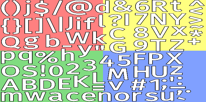
The font atlas rendered to itself:
An attempt at outlines:
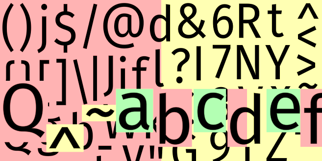
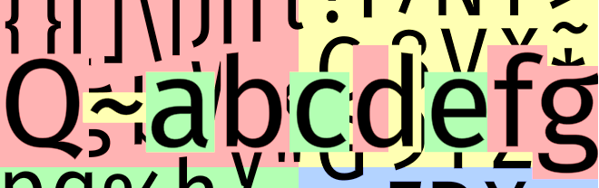
First attempt at drawing a string Q^~abcdef
I read the metrics files and realized that I was having trouble with Y-flipping. I made a little ascii drawing for myself, and got the positioning right. I wanted to test a descender so I took out ^ and added g:
The background was distracting so I took it out. Now I can see how the sprites overlap:

I also tried a different font to see how it compares:

6 First implementation#
I first tried the shader from msdf-bmfont-xml:
void main(void)
{
    float smoothing = clamp(2.0 * u_pxrange / u_fontSize, 0.0, 0.5);

    vec2 textureCoord = vTextureCoord * 2.;
    vec3 sample = texture2D(uSampler, vTextureCoord).rgb;
    float dist = median(sample.r, sample.g, sample.b);

    float alpha;
    vec3 color;

    // dirty if statment, will change soon
    if (strokeWeight > 0.0) {
        alpha = smoothstep(strokeWeight - smoothing, strokeWeight + smoothing, dist);
        float outlineFactor = smoothstep(u_weight - smoothing, u_weight + smoothing, dist);
        color = mix(strokeColor, u_color, outlineFactor) * alpha;
    } else {
        alpha = smoothstep(u_weight - smoothing, u_weight + smoothing, dist);
        color = u_color * alpha;
    }
    vec4 text = vec4(color * tint, alpha) * u_alpha;
    if (hasShadow == false) {
        gl_FragColor = text;
    } else {
        vec3 shadowSample = texture2D(uSampler, vTextureCoord - shadowOffset).rgb;
        float shadowDist = median(shadowSample.r, shadowSample.g, shadowSample.b);
        float distAlpha = smoothstep(0.5 - shadowSmoothing, 0.5 + shadowSmoothing, shadowDist);
        vec4 shadow = vec4(shadowColor, shadowAlpha * distAlpha);
        gl_FragColor = mix(shadow, text, text.a);
    }
}
It supports outlines, and has a lot of parameters. It looks great at large sizes, but didn’t look so good at small sizes. I didn’t want to spend my time fiddling with parameters. So I next tried the two shaders on the msdfgen page[13].
The first one “for 2D” doesn’t define screenPxRange() but gives the formula in the text.
void main() {
    vec3 msd = texture(msdf, texCoord).rgb;
    float sd = median(msd.r, msd.g, msd.b);
    float screenPxDistance = screenPxRange()*(sd - 0.5);
    float opacity = clamp(screenPxDistance + 0.5, 0.0, 1.0);
    color = mix(bgColor, fgColor, opacity);
}
This assumes the font size on screen is fixed, and that you’ll pass in the px range parameters in a uniform. I fiddled with this a little but it seemed like I needed to calculate things just right, or end up with weird text [update: I finally figured out the bug in 2026, and included the code in my sdf font guide]:

I decided that since I will have many different font sizes, I should try the second version.
It’s “for 3D” but calculates screenPxRange() using shader derivatives. It works for any font size, and I ended up using it for 2D.
float screenPxRange() {
    vec2 unitRange = vec2(pxRange)/vec2(textureSize(msdf, 0));
    vec2 screenTexSize = vec2(1.0)/fwidth(texCoord);
    return max(0.5*dot(unitRange, screenTexSize), 1.0);
}
It’s easier, and my goal here is do to the easiest thing. It looks better “out of the box”:

7 Experiments#
I found comments on reddit[14] about improving the output quality from a distance field shader. They recommended keeping mipmaps off, and I already had them off. Other suggestions I wanted to test:
- At small font sizes, use a slightly wider edge distance, 0.515 instead of 0.500 supersampling off
- supersample 5 points instead of 1
- uses smoothstep not the linear ramp
- use a sharper slope (0.5 + 0.5x vs 0.6 + 1x)
I did these experiments by alternating two versions. For example, to test gamma 1.5 vs gamma 1.0, I did this:
let alternate = false;
setInterval(() => {
    alternate = !alternate;
    if (alternate) {
        // gamma corrected
        parameters.u_gamma[0] = 1.5;
        gl.clearColor(0.1, 0, 0, 1);
    } else {
        // not gamma corrected
        parameters.u_gamma[0] = 1;
        gl.clearColor(0, 0, 0.1, 1);
    }
    render();
}, 1000);
Every ½ second I would switch from a slightly red background (experiment) to a slightly blue background (baseline). I stared at these for a while to try to decide which I liked better.
- Tested two different
biasvalues (the 0.515 vs 0.500) → didn’t see much difference - Supersampling → slightly blurrier but slightly better font shapes, not a huge win
- Smoothstep → slightly sharper, not a huge win
- Sharper slope → slightly uglier
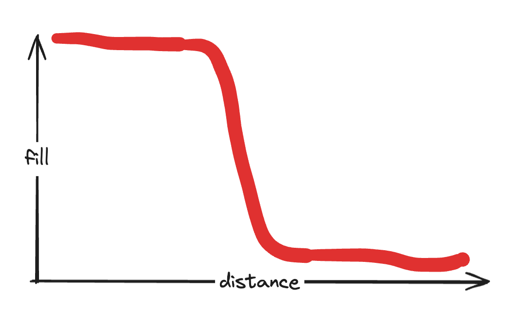
Overall I didn’t adopt any of these recommendations, but I think I now better understand why supersampling is useful. Consider this case:
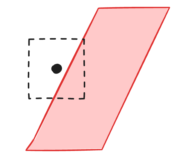
The antialiasing is trying to estimate how much of the box is covered by the shape. All it knows is distance to the closest edge. If that distance is 0 then the box is ½ covered, and should be alpha=0.5. If that distance is negative then it’s more than ½ covered, and if it’s positive it’s less than ½ covered.
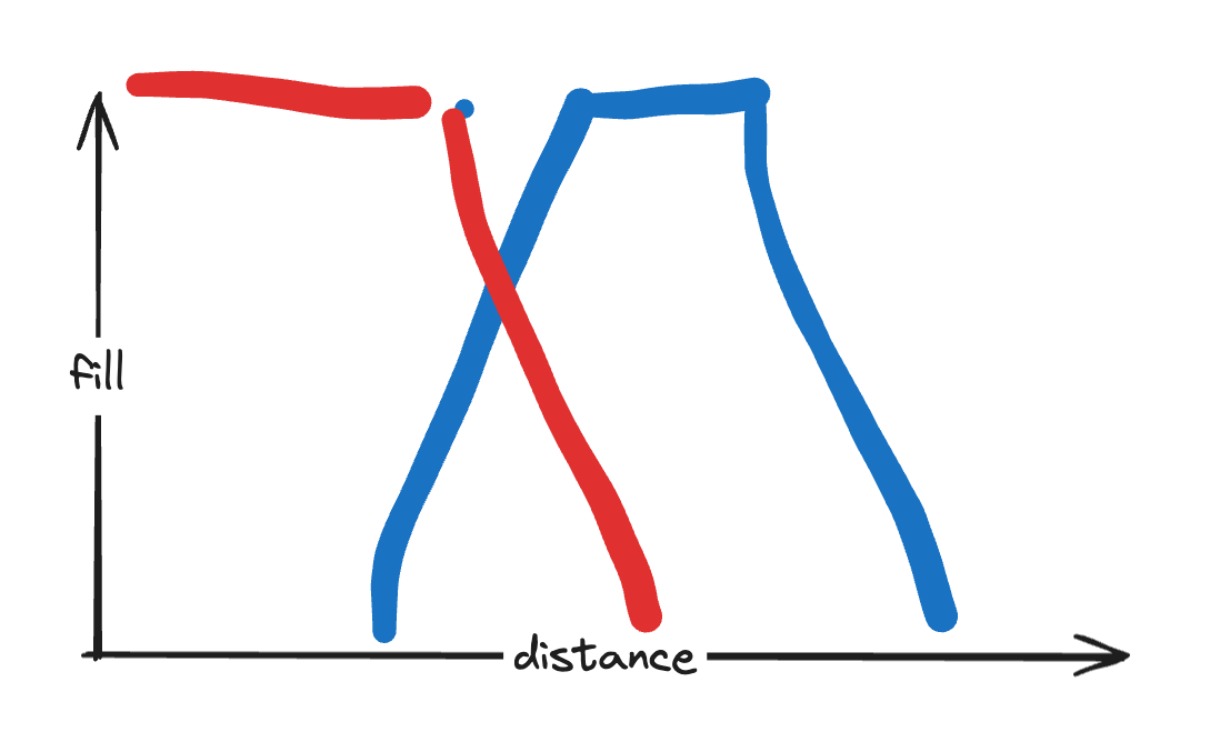
But what if the shape was like this?
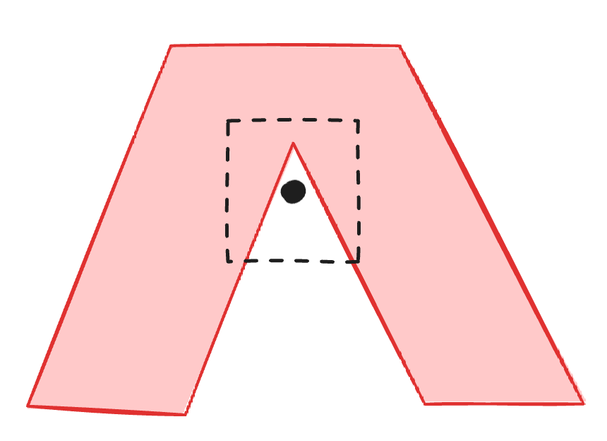
Now distance is not a good way to estimate the coverage. The distance is the same as in the previous example but the coverage should be much higher. Supersampling lets us improve this.
And sure enough, it was corners like this where I saw an improvement from supersampling. But overall, supersampling seemed blurrier. I think this is where suggestion 5 comes into play. A sharper slope would correspond to the sampling points being closer together. Supersampling does that, right? I am not sure but it did seem like supersampling alone made things blurrier, and sharper slope made things uglier, but the two at the same time was good.
Even though it was good, it wasn’t so good. It was slightly better in some places and slightly worse in other places. The font shape was generally better but a little blurrier.
I decided it wasn’t that important, and moved on. Then I found a discussion with the msdfgen author[15] where he says there’s not much to be gained from supersampling.
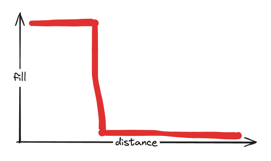
I tried various ramps from filled to not-filled. The simplest one makes very sharp ugly edges:
Linear is what the msdf library recommends:

Smoothstep is what I’ve seen used and recommended elsewhere:
And once I work on outlines (next week) I’ll need to figure out how to combine them:
I decided linear was the simplest, and smoothstep didn’t look that much different.
People much more knowledgeable than me say that gamma correction matters a lot. I tried gamma correction, based on this article from puredevsoftware[16]. This quote was interesting:
Because so many programmers have neglected gamma blending for so long, people who have created fonts have tried to work around the problem of fonts looking too thin by just making the fonts thicker! Obviously it doesn’t help the jaggedness, but it does make them look the proper weight, as originally intended. The obvious problem with this is that if we want to gamma blend correctly many older fonts will look wrong. So we compromise, and use a lower gamma value, so we get a bit better antialiasing, but the fonts don’t look too heavy.
I think the gamma corrected version did look a little better, but it depended on white on black vs black on white, and I just don’t think I can implement this correctly in a project that isn’t itself using gamma-correct rendering. So I decided not to use this right now. But I think it might be worth composing the smoothstep and gamma together and coming up with a new polynomial that approximates the two combined, instead of running the two separately. Also, if I end up using a black outline around white text, I do know the background color for the white/black boundary, and I could gamma correct that.
The author of msdfgen has this in one of this demos[17], showing that it does depend on background color.
// Workaround for non-sRGB-correct WebGL context:
gl_FragColor = vec4(pow(mix(pow(BG_COLOR, vec3(GAMMA)), vec3(1.0), opacity), vec3(1.0/GAMMA))-BG_COLOR, 1.0);
[Update: However, I later determined that gamma 1.5 and increasing out_bias by ⅛ produce similar output, so I overestimated the improvement that gamma provided, and I can get most of it instead by changing the bias. Gamma 1.5 is what I’ve seen in several sources including this blog post about gamma[18]: “most fonts have been designed for gamma-incorrect font rasterizers, hence if you use linear space (correctly), then the fonts will look thinner than they should”. Update I discovered that the antialiasing I’m using isn’t symmetric, and that causes the fonts to look wider at different gamma settings, and that might be why out_bias was producing an effect similar to gamma. It’s quite possible that changing the antialiasing to be symmetric will make the effect of gamma correction better.]
8 More#
https://css-tricks.com/techniques-for-rendering-text-with-webgl/[19] has an overview of drawing text with beziers, font atlases, distance fields, and multi distance fields. I wish I had found this article before starting this page.
At small font sizes, traditional renderers use hinting to improve the rendering. But distance fields don’t work with hinting.
At large font sizes, distance field sprites are full of empty pixels. If your project is fill rate limited this may be a problem.
Distance fields also have the problem that the set of characters is decided ahead of time, which makes it hard to support all of Unicode.
Sean Barrett describes the stb_truetype algorithm[20], which runs on the GPU and generates texture data. Will Dobbie describes storing vector data in an atlas[21], so that the GPU can render the vectors instead of a bitmap. The Slug library[22] and Ultralight library[23] and Pathfinder library[24] don’t use distance fields. Pathfinder’s wiki lists other approaches[25].
stb_truetype.h can generate SDFs, and says that you can offset the distance range and slope. The tradeoff is that you need more precision on the interior to get good rendering at small font sizes, but you need more on the exterior to get good outlines.
msdf-c[26] and its single-header-file fork msdf_c[27] build on stb_truetype to build an MSDF instead of an SDF. They are single file C programs and look much simpler to integrate into a project than the full C++ msdfgen reference implementation.
Raph Linus on HN says[28] “My personal feeling is that the world is moving on from distance fields, and the state of the art is doing vector rasterization in the GPU.”
So distance fields aren’t a panacea. I think the main appeal for me is that they’re small and simple.
This thesis research paper[29] has benchmarks showing distance fields are much faster than Slug, but Slug is more accurate especially with complex fonts.
Steven Wittens has a detailed post explaining how to improve distance field fonts[30] that are generated from a raster input. He uses gamma correction and also pixel bleed to improve the rendering. He writes, “The ‘blurry text’ that some people associate with anti-aliasing is usually just text blended with the wrong gamma curve, and without an appropriate bleed for the font in question.” However In my own experiments I wasn’t able to get much improvement with gamma correction, so I was probably doing something wrong.
opentype.js[31] can parse the ttf file and tell you the paths and metrics. But it’s really huge, 412kb.
tiny-sdf[32] can generate an sdf from a font by using the browser’s built in renderer and then converting that output to an sdf. Clever! It’s only 2kb. It was designed for fixed width fonts, and I want to try it with proportional fonts. It doesn’t support kerning.
I’d like to try this with a Linear A font.
I’d like to try Smooth Min[33] and other distance field operations on these fonts. I suspect they will work better with SDF than with MSDF.
This shadertoy[34] has some more references I want to read.
My source file: distance-field-fonts.js (note: this is the latest implementation, which adds sliders and extra features to the shader)