This week I am going to try learning how to make outline and bevel effects with signed distance field fonts.
1 msdf-atlas-gen#
Last week I was using msdf-bmfont-xml[1] (javascript tool, outputs msdf files with “bmfont” layout format). This week I decided to try msdf-atlas-gen[2] (c++ tool, outputs msdf or mtsdf files with json, csv or other layout formats). For the effects I want to use mtsdf because it has both the sharp corner data and round corner data.
cd ~/Projects/src
git clone https://github.com/Chlumsky/msdf-atlas-gen
cd msdf-atlas-gen

git submodule init
git submodule update

cmake .
make
I then generated an atlas:
~/Projects/src/msdf-atlas-gen/bin/msdf-atlas-gen
   -type mtsdf -pxrange 4 \
   -font ~/Library/Fonts/FiraSans-Regular.otf \
   -imageout assets/FiraSans-Regular.png \
   -json assets/FiraSans-Regular.json
Notes:
- this atlas generator doesn’t have the border or padding options
- the csv format doesn’t have the kerning data[3]
- json supports some font kerning data (
kern) but not others (GPOS)[4]?- so far in the fonts I’ve tried, only Vegur’s kerning shows up in msdf-font-atlas
- workaround for getting GPOS kerning data into msdf-atlas-gen[5]
- the format is more convenient for rendering than the bmfont format
- [Update] I later switched from
pxrangetoemrange
2 Distance field resolution#
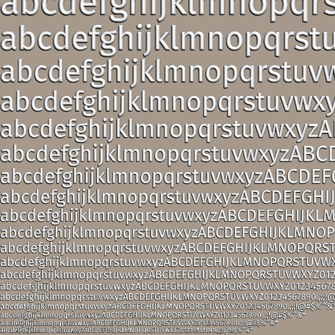
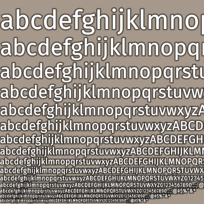
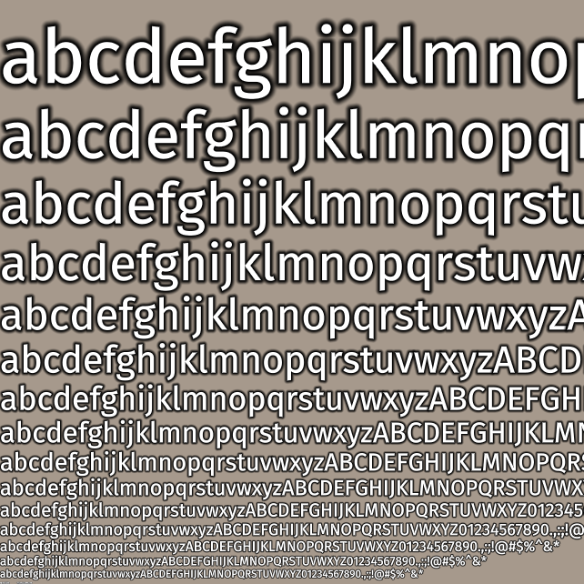
I tried generating the distance field texture at a different sizes using the -size option, and I think the default of 32px is pretty good, but you can see a small glitch in the g that goes away at 40px:
| Input | Output | Distance field | Rendered |
|---|---|---|---|
| 16px | 120✕120 20kb |  |
 |
| 24px | 164✕164 30kb |  |
 |
| 32px | 204✕204 40kb |  |
 |
| 40px | 248✕248 50kb |  |
 |
For various reasons I think 256✕256 would be a good size for my project so I regenerated the distance fields using:
~/Projects/src/msdf-atlas-gen/bin/msdf-atlas-gen \
   -type mtsdf -dimensions 256 256 -pxrange 4 \
   -font ~/Library/Fonts/FiraSans-Regular.otf \
   -imageout assets/FiraSans-Regular.png \
   -json assets/FiraSans-Regular.json
However, it looked much worse! I figured out that at 256✕256, twgl.js automatically made mipmaps, which I did not want. And I didn’t figure out how to disable that. So I set it to 255✕255 for now, and will investigate this later.
Command to generate the font data for different sizes: (but I then took the screenshots manually)
for size in 16 24 32 40
do
    ~/Projects/src/msdf-atlas-gen/bin/msdf-atlas-gen \
       -type msdf -pxrange 4 -size ${size} \
       -font ~/Library/Fonts/FiraSans-Regular.otf \
       -imageout blog/FiraSans-Regular-${size}px.png \
       -json /tmp/FiraSans-Regular.json
done
A distraction — the -coloringstrategy distance option can improve quality but runs slower [discussion][6]. I tried it and it didn’t make a difference on Fira Sans, but it did on Merriweather. It depends on the font size and complexity, so you’ll have to try things with the font you want.
3 One or three distance fields#
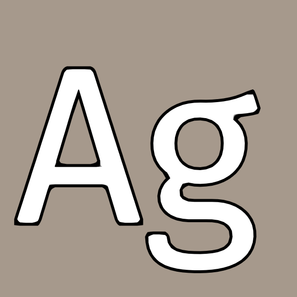
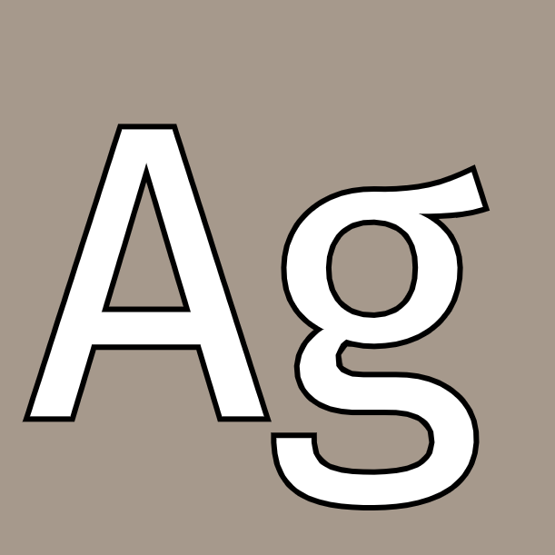
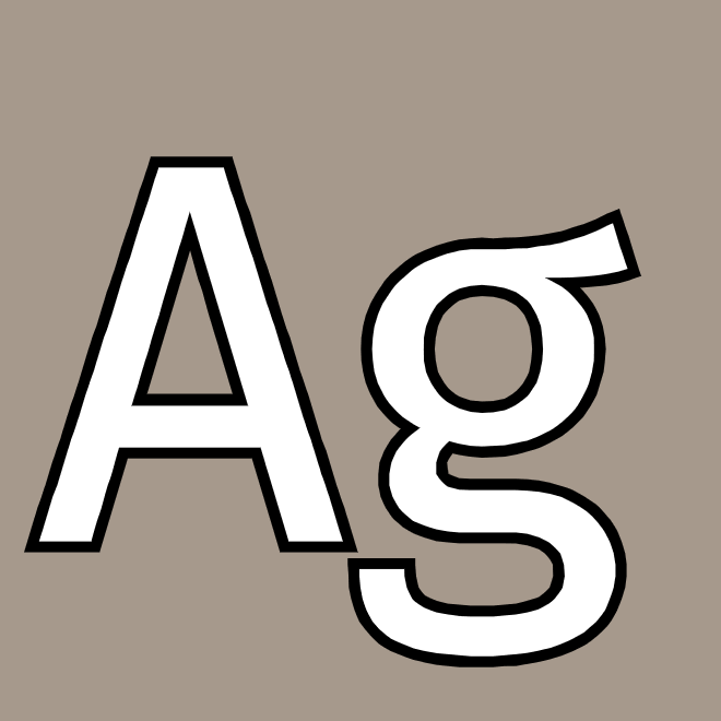
One of the claims made by the msdfgen project[7] is that is preserves sharp corners better than regular signed distance fields. And it does, especially on the letter A! But I wanted to see it for myself.
I tried this fragment shader to draw in blue where the regular distance field worked and white where they differed:
void main() {
  vec4 sd = texture2D(u_msdf_font, v_texcoord);
  float distance = median(sd.r, sd.g, sd.b);
  float width = screenPxRange();
  float e = width * (distance - 0.5 + u_in_bias) + 0.5 + u_out_bias;
  float opacity = clamp(e, 0.0, 1.0);

  // Show the places where the msdf differs from sdf
  float opacity2 = clamp(width * (sd.a - 0.5 + u_in_bias) + 0.5 + u_out_bias, 0.0, 1.0);
  gl_FragColor = vec4(1.0 - opacity2, 1.0 - opacity2, opacity2, 1) * opacity;
}
Not bad. The regular distance field is decent. But you can see how all the sharp corners get cut off, and the multi distance field fixes that.
To better understand what the shapes looked like, I wanted to draw some contour lines, like I did last week. I should’ve kept that shader around but it was easy to regenerate.
| type | contour line output |
|---|---|
| sdf | 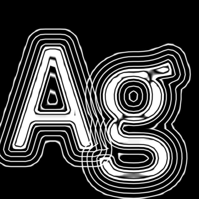 |
| msdf | 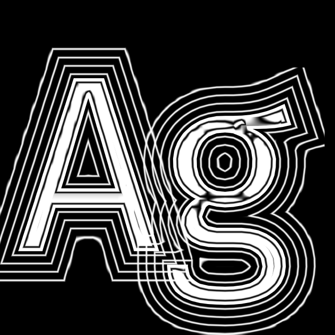 |
Some outline/glow effects will be better with the rounded sdf than with the sharp msdf. That’s why msdf-atlas-gen offers an option to bundle them together in the mtsdf format.
But the question remains, should I use sdf or msdf? The real test is to look at font sizes I’d actually be using. I used ImageMagick[8] to create gifs that flipped back and forth:
magick -delay 100 blog/allsizes-40px-sdf.png blog/allsizes-40px-msdf.png  -loop 0 blog/allsizes-40px-sdf-vs-msdf.gif
magick -delay 100 blog/allsizes-20px-sdf.png blog/allsizes-20px-msdf.png  -loop 0 blog/allsizes-20px-sdf-vs-msdf.gif
magick -delay 100 blog/allsizes-20px-sdf.png blog/allsizes-40px-sdf.png   -loop 0 blog/allsizes-20px-vs-40px-sdf.gif
magick -delay 100 blog/allsizes-20px-msdf.png blog/allsizes-40px-msdf.png -loop 0 blog/allsizes-20px-vs-40px-msdf.gif
magick -delay 100 blog/allsizes-20px-msdf.png blog/allsizes-40px-sdf.png  -loop 0 blog/allsizes-20px-msdf-vs-40px-sdf.gif
Here’s the sdf vs msdf at 40px resolution, which is what I’ve been using for tests:

At these font sizes, sdf and msdf look pretty similar. But here’s sdf vs msdf at 20px resolution:

Now you can see the difference. The sdf is much rounder.
Aha! This is something the msdfgen paper told me, but it didn’t really sink in until seeing these comparisons: to increase the quality of sdf you have to use a higher resolution than what you get with msdf. Here’s the 20px resolution msdf compared to the 40px resolution sdf, and they’re kind of similar:
But do I want 20px or 40px resolution? Well, I think I have plenty of texture space for the 40px version, so that’s not an issue. If I use sdf, 40px looks quite a bit better than 20px:

But if I use msdf, 40px and 20px look pretty close:

So this is making me think about the decision. I certainly like msdf especially at large font sizes. But in practice, it may not matter at smaller font sizes. And there’s more sdf software out there, like stb_truetype.
I think the font shapes matter a lot, and I’ve only been testing Fira Sans, which is a fairly simple sans serif font.
4 PxRange setting#
I tried generating the font with -pxrange set to 2 (default), 4, and 8, and attempted contour lines:
| pxrange | contour line output |
|---|---|
| 2 |  |
| 4 |  |
| 8 | |
Ok, so it looks like the -pxrange tells it how far outside the font to carry the distance information, and that will determine how thick my outline or glow effect can be. But the spacing between letters will also limit how thick I can make them without overlap.
4 seems like a good value. [Update: no, I discovered later that I needed something closer to 7 to get good outlines at various font sizes.] [Update again: no, I discovered that it was better to use emrange than pxrange.]
5 Outlines#
I waited too long to work on this. I gave myself a week for playing with outlines, but it’s Thursday already and I’m just starting to implement outlines. I got distracted by so many other things. Here’s a comparison between sdf and msdf for outlines:
I like the msdf version much better!
For small text though, it looks like I have an issue at the smaller font sizes. It looks like it’s shading the entire block. That may be ok for some purposes, but I am wondering what causes it:
I think I have a bug in my shader. I was using this:
void main() {
  vec4 distances = texture2D(u_mtsdf_font, v_texcoord);
  float d = median(distances.r, distances.g, distances.b);
  float width = screenPxRange();
  float inner = width * (d - 0.5 + u_in_bias            ) + 0.5 + u_out_bias;
  float outer = width * (d - 0.5 + u_in_bias + u_outline) + 0.5 + u_out_bias;

  float inner_opacity = clamp(inner, 0.0, 1.0);
  vec4 inner_color = vec4(1, 1, 1, 1);
  float outer_opacity = clamp(outer, 0.0, 1.0);
  vec4 outer_color = vec4(0, 0, 0, 1);

  vec4 color = (inner_color * inner_opacity) + (outer_color * outer_opacity);
  gl_FragColor = color;
}
But this is starting the blend from white to black before the outline actually hits. And that means even when I have outlines off, I still get a faint outline. The outlines are appearing where they shouldn’t. I don’t know if it’s the same bug that causes the blockiness but it’s something I need to fix.
So let me just print the values out. I did that but realized I would rather have an interactive chart.
width = 3.0
u_outline = 0.2
u_in_bias = 0.0
u_out_bias = 0.0

for d in [i/20 for i in range(20)]:
    inner = width * (d - 0.5 + u_in_bias            ) + 0.5 + u_out_bias
    outer = width * (d - 0.5 + u_in_bias + u_outline) + 0.5 + u_out_bias
    print(f"{d:.2f}, {inner:.2f}, {outer:.2f}")
I plotted it here: https://observablehq.com/@redblobgames/outline-calculation-for-https-www-redblobgames-com-x-2404-d[9]
Looking at the chart, I should’ve been able to draw that out by hand. I’m not sure why it didn’t occur to me how simple the output is. I stared at it and realized I don’t know what the “right thing to do” is for variable outline sizes. Maybe the current shader is ok, and I should use a different shader for non-outline.
Or maybe what I should do is start with hard edges and then try to calculate the sliding window integral. This seems too complicated. And probably not important because I have a lot of other effects I want to try.
I took a walk and came back with some more ideas for debugging. Eventually I figured out that I’m exceeding what the pxrange of 4 could handle. I increased it one by one until I got good results at 7. But weirdly, if I increase the font resolution, things get worse again. So I feel like I have accidentally found something that works, not something based on principle. That bugs me. But it will have to wait until I have more ideas.
6 Debugging outlines#
Ok, after some sleep I decided I am very much bothered by something that accidentally works, and I want to look at it again. I’m not under deadline so I think I can give myself time to do this and wait until next week for the other effects I want to try.
I noticed yesterday that when I increase the font resolution, I get more blocky shadows, and when I increase the pxrange, I get less blocky shadows. Why?? I generated a higher resolution sdf file (not msdf, as I want to see if it still happens with regular sdf):
~/Projects/src/msdf-atlas-gen/bin/msdf-atlas-gen \
    -font ~/Library/Fonts/FiraSans-Regular.otf \
    -type sdf -pxrange 7 -dimensions 511 511 \
    -imageout assets/FiraSans-Regular-hires.png \
    -json assets/FiraSans-Regular-hires.json
That’s bad.
In experimenting, I found that what mattered was the ratio of the pixel resolution to the pxrange. Ok, that’s interesting. The pxrange parameter is expressed in pixels, and the pixel resolution is also in pixels. If I instead use the emrange paramter, that’s relative to the font size, so if I double the font resolution it doubles the border. That’s probably what I should be using.
The other thing to note is that my outlines are defined in absolute units, not relative to the font size. So that means at small font sizes, the outlines are just too large relative to the font.
I can fix this problem by a combination of:
- switching from
pxrangetoemrange - embiggening the
emrangefrom 0.1 to something higher - shrinking the outline width from 1px to 0.75px
- setting an outline relative to the font size instead of in absolute units
I decided to implement all of these. I updated my command for generating these:
~/Projects/src/msdf-atlas-gen/bin/msdf-atlas-gen \
    -type mtsdf -emrange 0.2 -dimensions 255 255 \
    -font ~/Library/Fonts/FiraSans-Regular.otf \
    -imageout assets/FiraSans-Regular.png \
    -json assets/FiraSans-Regular.json
This produced a font resolution of 32px and a pxrange of roughly 6.5. This explains why I needed the pxrange to be 7 in my earlier experimentation.
Through some experimentation I decided to set the default absolute outline width to 1/3px, and the relative outline width to 1/16th the font size. At a small font size, the absolute width contributes significantly. At a large font size, the relative width contributes significantly. I think this combination is a pleasing default.
But because I want to play with the sliders in this demo app, I decided to set the emrange to 0.5 and font resolution to ~48 to accomodate larger absolute widths. For a real project I would probably use 0.2 and ~36.
~/Projects/src/msdf-atlas-gen/bin/msdf-atlas-gen \
    -type mtsdf -emrange 0.5 -dimensions 511 511 \
    -font ~/Library/Fonts/FiraSans-Regular.otf \
    -imageout assets/FiraSans-Regular.png \
    -json assets/FiraSans-Regular.json
I feel much better understanding why I was having this problem, and how to fix it. Here was the previous “accidental” fix:
and here’s the better fix:
7 Sharp interiors round exteriors#
I also wanted to try a hybrid, with an sdf outline and msdf inner text. It’s more noticeable at large sizes:

Notice the outline “bleed” on the interior corners, especially near the top of the A. That’s a downside of using sdf for the outline. I later figured out that it can be fixed by using max(sdf, msdf) instead of sdf.
8 Bevel effect#
For a bevel effect we need to know the direction of the gradient line. I think that comes from the dFdx and dFdy functions. First I wanted to see if they would indeed give me a direction.
#define M_PI 3.1415926535897932384626433832795

/* MIT license: https://github.com/tobspr/GLSL-Color-Spaces/blob/master/ColorSpaces.inc.glsl */
vec3 hue_to_rgb(float hue) {
    hue = mod(hue, 1.0);
    float R = abs(hue * 6.0 - 3.0) - 1.0;
    float G = 2.0 - abs(hue * 6.0 - 2.0);
    float B = 2.0 - abs(hue * 6.0 - 4.0);
    return clamp(vec3(R,G,B),0.0,1.0);
}

void main() {
  // ... same as before

  // HACK: color by angle
  vec2 normal = normalize(vec2(dFdx(d_inner), dFdy(d_inner)));
  float angle = atan(normal.y, normal.x);
  gl_FragColor = vec4(hue_to_rgb(angle / M_PI / 2.0), outer_opacity);
}
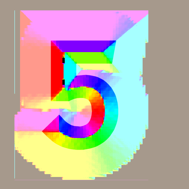
It does! But you can see there are some glitches in places, mainly at the center lines where the direction changes abruptly. I’m not sure yet whether the glitches will cause problems.
So the next thing to do is use that gradient for lighting.
void main() {
  vec4 distances = texture2D(u_mtsdf_font, v_texcoord);
  float d_msdf = median(distances.r, distances.g, distances.b);
  float d_sdf = distances.a; // mtsdf format only
  float d_inner = mix(d_msdf, d_sdf, u_rounded_fonts);
  float d_outer = mix(d_msdf, d_sdf, u_rounded_outlines);
  float width = screenPxRange();
  float inner = width * (d_inner - u_threshold) + 0.5 + u_out_bias;
  float outer = width * (d_outer - u_threshold + u_outline_width_relative) + 0.5 + u_out_bias + u_outline_width_absolute;

  float inner_opacity = clamp(inner, 0.0, 1.0);
  vec4 inner_color = vec4(1, 1, 1, 1);
  float outer_opacity = clamp(outer, 0.0, 1.0);
  vec4 outer_color = vec4(0, 0, 0, 1);

  // apply some lighting (hard coded angle)
  flost u_gradient = 0.15;
  vec2 normal = normalize(vec3(dFdx(d_inner), dFdy(d_inner), 0.01)).xy;
  float light = 0.5 * (1.0 + dot(normal, normalize(vec2(-0.3, -0.5))));
  inner_color = mix(inner_color, vec4(light, light, light, 1),
                    smoothstep(u_gradient + u_threshold, u_threshold, d_inner));

  vec4 color = (inner_color * inner_opacity) + (outer_color * outer_opacity);
  gl_FragColor = color;
}
Well, it looks pretty good! I had to turn the outlines down and increase the width of the font for this:
It works better with larger fonts. With a more aggressive u_gradient value, I can get this:

Ok, these are potentially useful effects.
9 Glow and shadow#
I implemented a quick&dirty shadow blur with
// HACK: blurred outline, but this is the wrong way to do it
outer = width / u_outline_blur * (d_outer - inverted_threshold + u_outline_width_relative * u_outline_blur) + 0.5
      + u_out_bias + u_outline_width_absolute * u_outline_blur;
and I think it looks good for large sizes but it doesn’t scale properly (same kind of problem I had earlier with outlines not scaling well), so I need to go back and fix that formula. But the quick&dirty version told me what I wanted to know: that it is possible, and that it looks pretty good at large sizes:
I also changed the colors to make it look like a glow, and in doing so realized I had a bug in my color calculation. I changed
vec4 color = (inner_color * inner_opacity) + (outer_color * outer_opacity);
to
vec4 color = (inner_color * inner_opacity) + (outer_color * (outer_opacity - inner_opacity));
Now it works with any color text and outline and glow and shadow.
10 Fixing shadow scaling#
I still have the scaling problem. I came back to it the next week . I went back to first principles. I want the blur to be 1.0 where the outline starts (inverted_threshold) and 0.0 where the outline ends (inverted_threshold - u_outline_width_relative). So I used this:
outer_color.a = smoothstep(inverted_threshold - u_outline_width_relative,
                           inverted_threshold,
                           d_outer);
and that worked nicely! However, the outline start/end points actually vary a little more than that, based on other variables (u_outline_blur, u_outline_width_absolute, u_out_bias).
The real starting and ending points for the outline are more complicated. I looked at the code:
float inner = width * (d_inner - inverted_threshold) + 0.5 + u_out_bias;
float outer = width * (d_outer - inverted_threshold + u_outline_width_relative) + 0.5 + u_out_bias + u_outline_width_absolute;
The starting point is roughly when inner = 0.0, and the ending point is roughly when outer = 0.0. I could solve for these. But I feel like I might be overcomplicating things.
I can express outer in terms of inner. First, let me change how outer is calculated to look more similar to inner:
float inner = width * (d_inner - inverted_threshold) + 0.5 + u_out_bias;
float outer = width * (d_outer - inverted_threshold) + width * u_outline_width_relative + 0.5 + u_out_bias + u_outline_width_absolute;
For now let’s assume d_outer and d_inner are the same, just d. Then
float inner = width * (d - inverted_threshold) + 0.5 + u_out_bias;
float outer = width * (d - inverted_threshold) + 0.5 + u_out_bias + width * u_outline_width_relative + u_outline_width_absolute;
Then
float inner = width * (d - inverted_threshold) + 0.5 + u_out_bias;
float outer = inner + width * u_outline_width_relative + u_outline_width_absolute;
Ok, does this help? Maybe. I’m solving for d:
X = width * (d - inverted_threshold) + 0.5 + u_out_bias

d = (-X - 0.5 - u_out_bias) / width + inverted_threshold
So if the outline starts when inner is 0, then d is (- 0.5 - u_out_bias) / width + inverted_threshold.
If the outline ends when outer is 0, then d is -(-width * u_outline_width_relative - u_outline_width_absolute - 0.5 - u_out_bias) / width + inverted_threshold.
The 0.5 I wasn’t sure about, so I played with it and found that I liked the effect better at 0.0.
But I still needed to figure out what u_outline_blur should actually do. I decided when it’s 0, it should be a solid outline, and when it’s 1 it should be a blurred outline. After some rewriting, I ended up at
outer_color.a = smoothstep(u_outline_width_relative + u_outline_width_absolute / width,
                           0.0,
                           inverted_threshold - d - u_out_bias / width);
I think this form is harder to reason about in many ways, but the advantage is that I can see a very obvious “goes from 0 to X” range, and then I can apply u_outline_blur to that range. There’s probably a better way to write this, but at least it does what I want:
if (u_outline_blur > 0.0) {
  float blur_start = u_outline_width_relative + u_outline_width_absolute / width;
  outer_color.a = smoothstep(blur_start,
                             blur_start * (1.0 - u_outline_blur),
                             inverted_threshold - d - u_out_bias / width);
}
Compare the old shadow formula that didn’t scale:
to the new shadow formula that scales:
However I think the shadows are a little too thick. And I don’t have a good way to show a sharp outline at the same time as a rounded shadow. So I think this function needs another look at some point.
I’ve accumulated various parameters over time and I think there’s probably a simpler way to express them. I didn’t try to find that simpler way in this learning project, but I might revisit it later.
11 More#
The sdf file is roughly twice the size of a regular font atlas; the msdf file is roughty twice the size of an sdf file.
I didn’t get the shadow (blur outline) scaling right but it’s something I will come back to if I want to use it in a project. I think it’s probably a relatively simple fix, but I ran out of time for the week’s experiments.
I ended up using a larger msdf texture than necessary. If I apply this to a real project, I can evaluate shrinking it back down. But I can’t conclude the “best size” here on this page, because it depends on the font complexity and also the font sizes being used. I only did a little bit of experimentation here to get a feel for it. One unfortunate side effect of having a larger msdf is that the rounded fonts (sdf) weren’t as round as they would normally be. That’s ok. I took screenshots with a smaller texture to show the difference.
Source: distance-field-effects.js