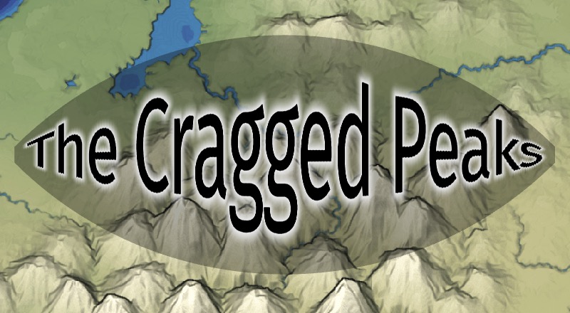
I have always made maps without labels on them, but I wanted to try adding some labels to see how it would look, and what effects I could use.
TODO:
-
[-]background image-
[X]load a static image -
[ ]load a user-specified image -
[ ]handle aspect ratio other than 1:1
-
-
[X]labels-
[X]static label -
[X]angled label -
[X]curved label -
[X]letter spacing -
[X]multiple labels -
[X]ui for editing multiple labels -
[X]click edit button to open editing dialog -
[X]drag and drop to move label around - maybe center drag handle -
[X]drag and drop to rotate and size label - maybe left drag handle for spacing+curvature, right for size+rotation -
[X]sliders for color, shadow, glow, halo -
[X]sliders for spacing -
[X]sliders for curved path -
[X]font effects (synthetic bold and oblique)
-
-
[-]text effects-
[X]outline in shader -
[-]halo in shader instead of a separate pass-
[X]v1 -
[X]v2 - changed the curve, made it work with drop shadow too -
[ ]v3 - still unhappy with curve, not sure what to do yet -
[X]use blurred background color instead of solid color (see https://shadedrelief.com/type-halos/[1]) - but they put it above rivers, which requires integrating into a map generator -
[ ]use lighten/darken effect instead of regular blend
-
-
[X]drop shadow - see examples https://shadedrelief.com/3D_Terrain_Maps/3dterrainmapstyp.html[2]-
[X]v1 was a separate part of the shader -
[X]v2 was merging halo v1 and drop shadow v1
-
-
[X]figure out blend modes -
[X]simplify code for multiple layers (outline, halo, etc.)
-
-
[X]text quality-
[X]separate inner/outer colors -
[X]adjust anti-aliasing edge width (from 1 to 2) -
[X]adjust anti-aliasing using gamma correction -
[X]draw all shadow/outline first before inner text -
[X]merge distance fields together before rendering the label-
[X](temporary) merge with scale matching the output label -
[X]merge with scale matching the input atlas
-
-
-
[-]drag handles-
[X]implement incremental dragging - didn't work well -
[ ]implement geometric dragging -
[X]study the state space with visualizations -
[X]maybe implement gradient descent - on a separate page ; it didn't work well
-
TODO for standalone tool:
-
[ ]choose from a selection of maps -
[ ]drag your own image onto the page (deal with resizing) -
[X]upgrade to msdfgen 1.12, which changes some parameters and might require me to update my code -
[ ]font selection (sans serif, serif, monospace, and maybe fancy things like MedievalSharp[3]) -
[ ]export at a different resolution from the screen resolution
TODO if integrated into mapgen4:
-
[ ]blur halo should blur the terrain but not the rivers or roads -
[ ]maybe lighten the rivers/roads without blurring them -
[ ]drop shadow could be draped over the terrain while the text is floating above it
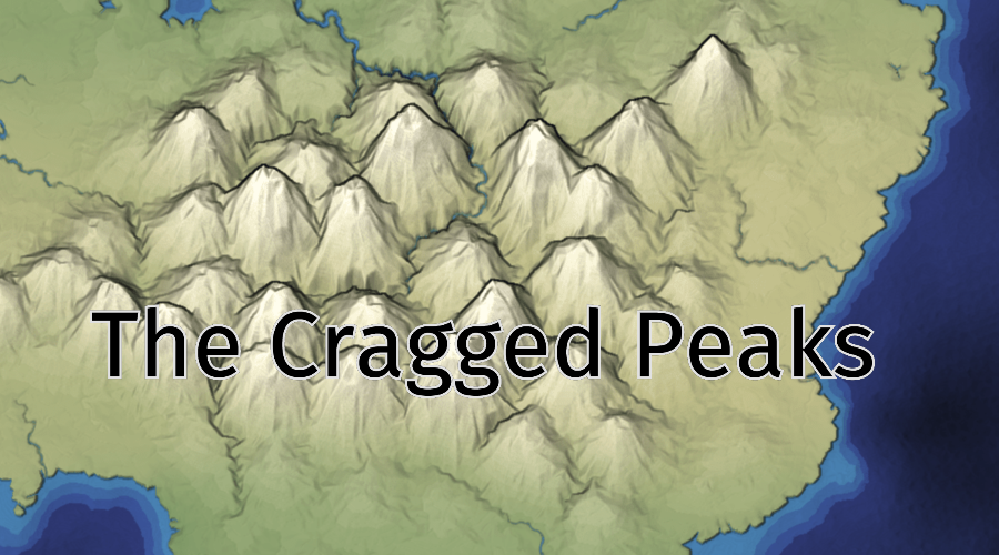
1 Project goal#
Although my end goal is to generate names along with a map, I decided the thing to do now is to focus on the labels. I would like to draw the text, outline, shadow, and halo all in one pass, by using a function from distance to color:
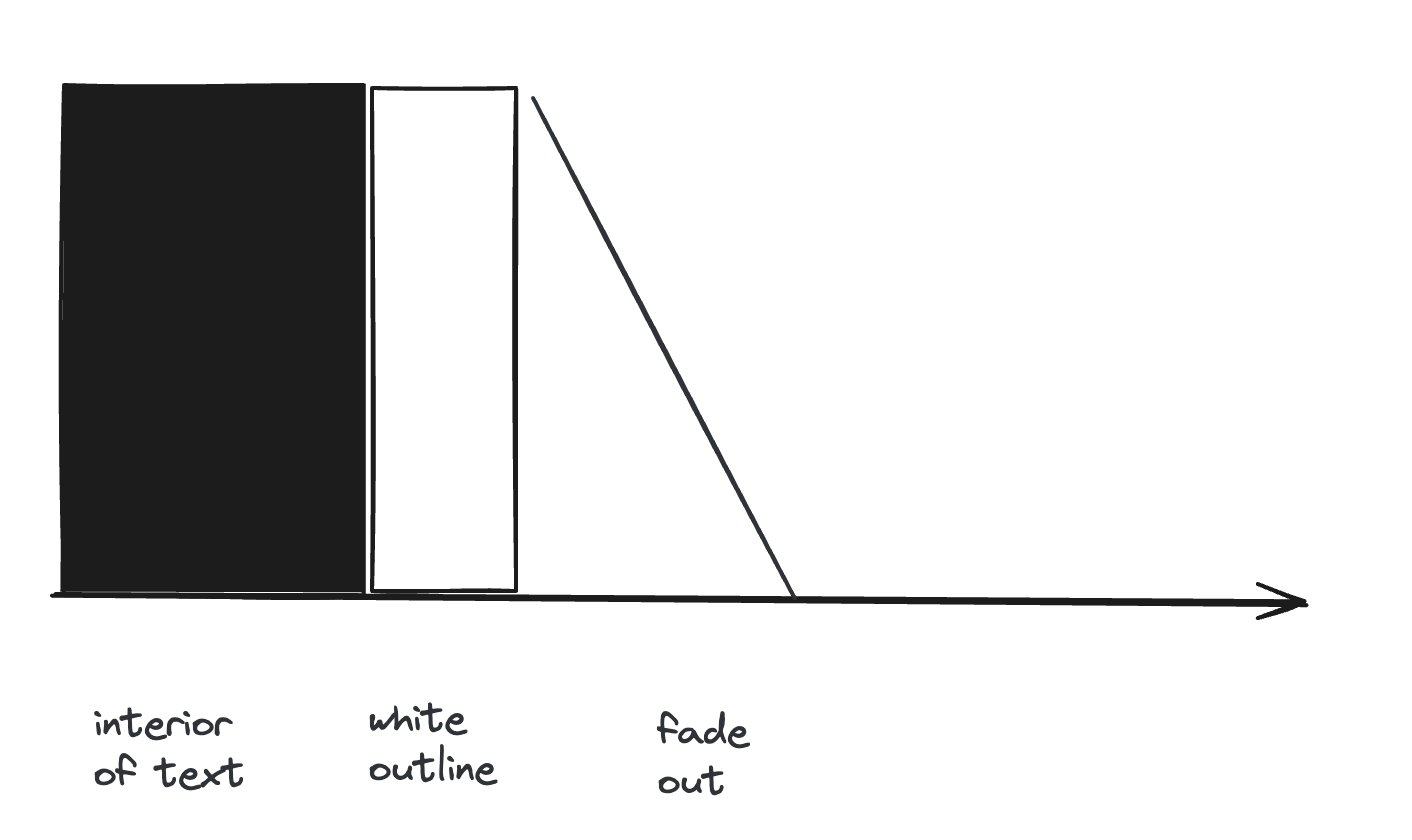
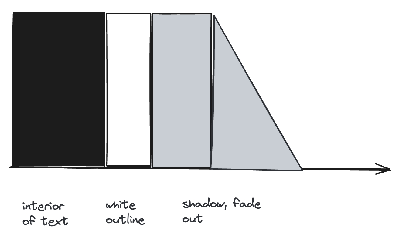
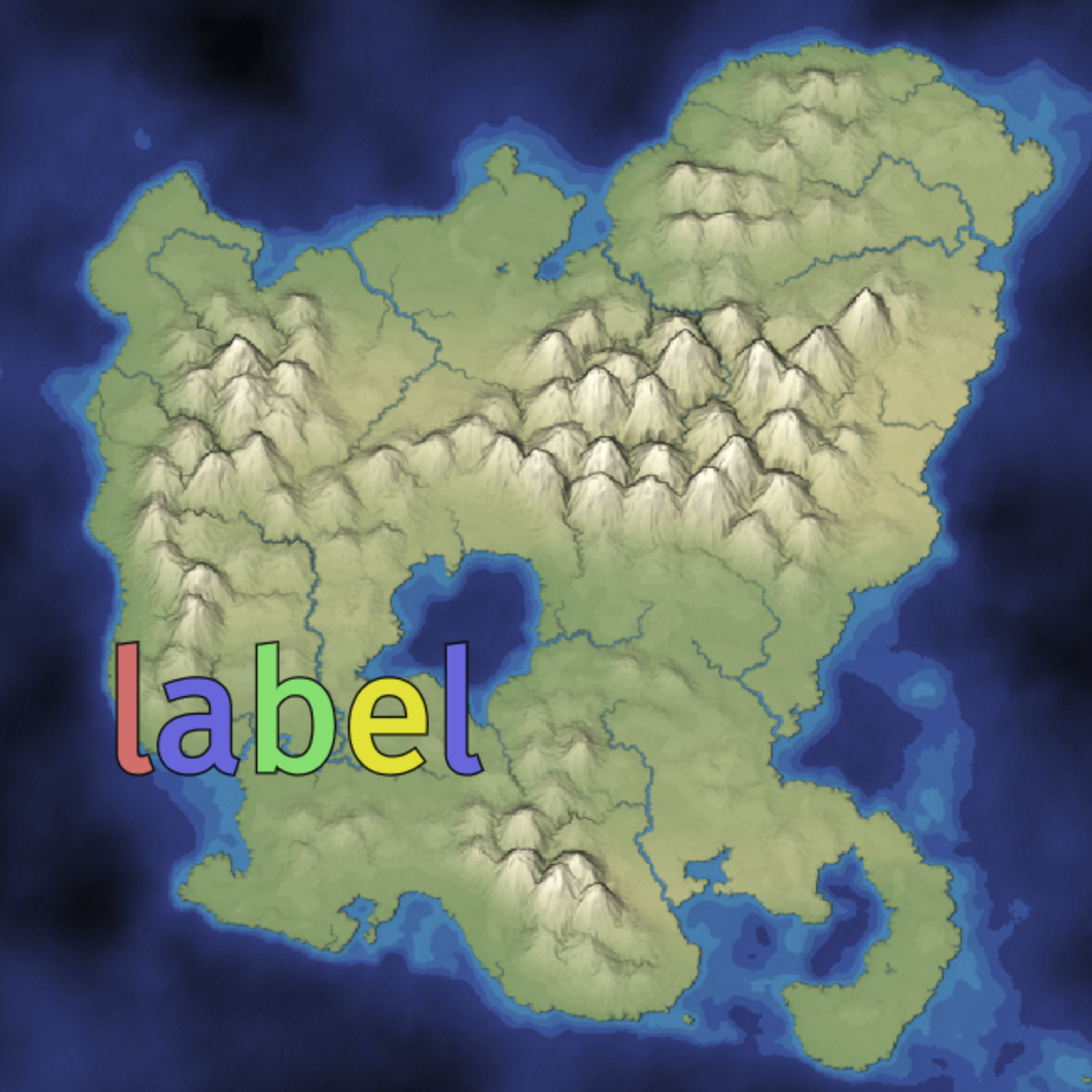
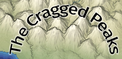
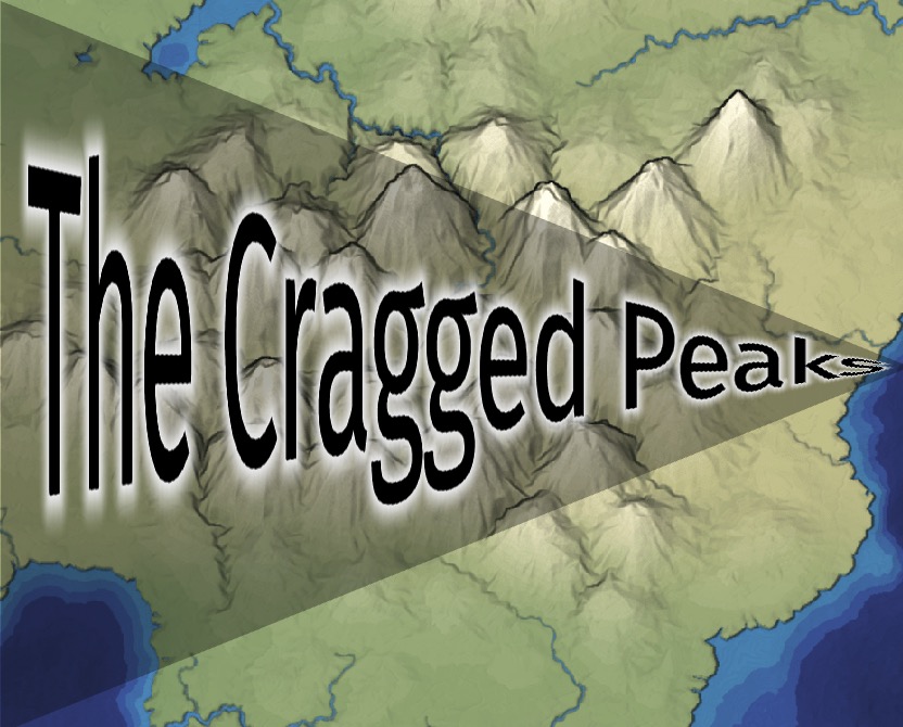
To avoid getting into the rabbit hole of generating maps, I started by loading a screenshot of a map. Then I added a label on top. I tried colors and then white text with black outline and black text with white outline:
2 Rendering text#
2.1 Bug: outline color#
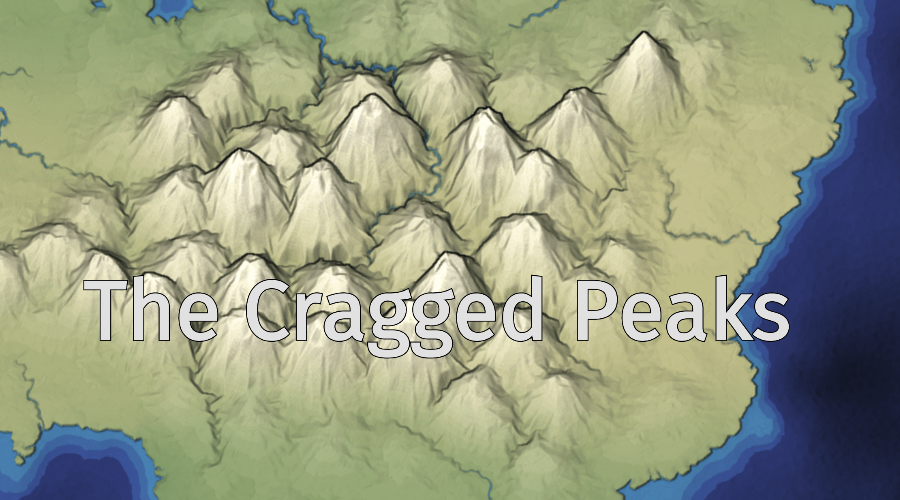
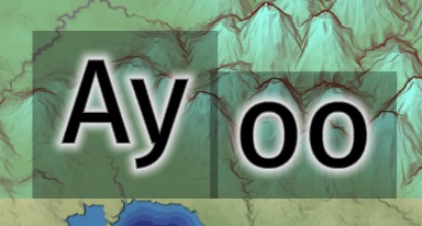
While looking closely at the black text with white outlines, I saw some black is "leaking" outside the white area:

At first I thought the text color was leaking out, so I changed it to yellow, and it was still black leaking out. It turns out I had an issue with premultiplied alpha. For proper blending, I need to use premultiplied alpha. And I thought I was doing that. But I was doing something wrong. I tweaked it until it worked. But I don't feel like I understand what I did wrong. I'll have to revisit that at some point.
I wrote more details on my blog.
2.2 Quality: letter spacing#
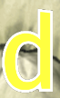
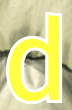
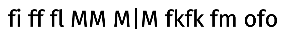
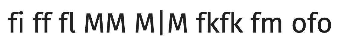
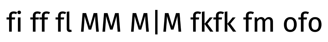
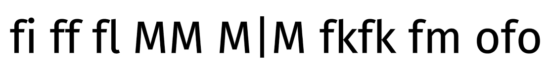
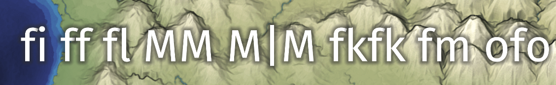
The other thing I noticed with the initial tests was that the k and s seemed very close together, and the h and e seem a little too far apart. Could it be kerning? Could it be lack of kerning? I rendered k and s with other letters to see if either one was the issue:
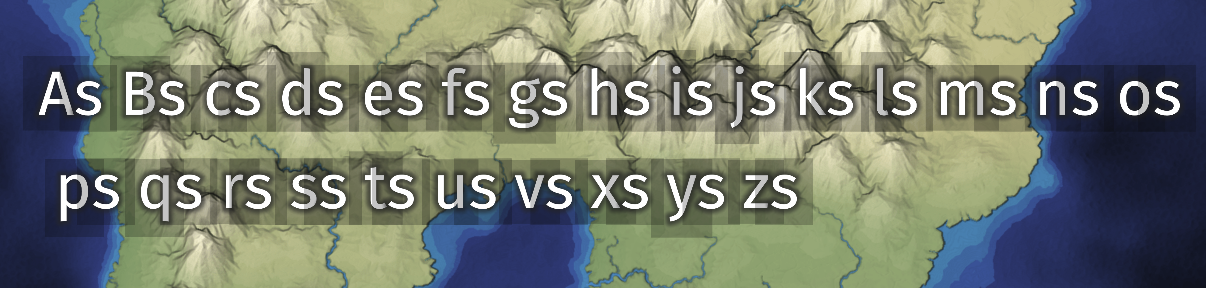
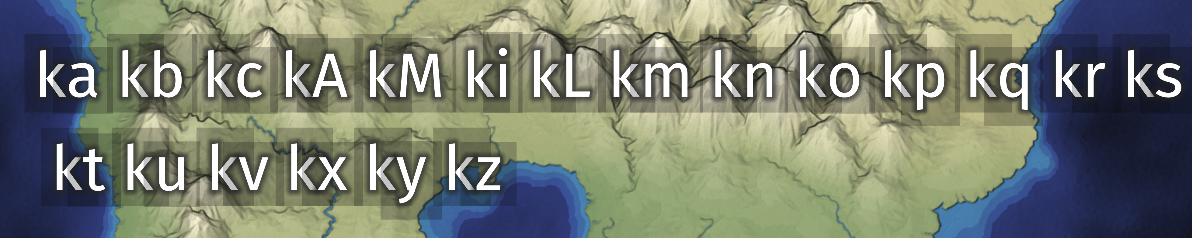
and it does seem like k is generally close to the letter to the right of it. I checked the font data and this font (Fira Sans) just doesn't have a kerning table in it. So that means the k is just a little bit close to its neighbor. I verified this by checking the rendering in Google Chrome on the Google Fonts web site (second image) and compared to my rendering (first image):

Sure enough, both the h + e and k + s spacing issues are there. So that's just how the font is. Ok.
BTW these screenshots are from Chrome/Mac. Chrome/Windows[4] has different rendering, and changed it in Feb 2025.
I wrote more details on my blog.
2.3 Quality: antialiasing#
But while I was looking at Fira Sans on Google Fonts[5], I noticed their antialiasing looked nicer than mine. So I started tweaking parameters:

and here you can see what I ended up with after tweaking edge width (from 1.0 to 2.0) and gamma (from 1.0 to 1.5):
I wasn't sure if I was imagining the gamma making a difference, so I looked really closely at mine (left) and Google's (right). The gray in the middle of the gradient should be half brightness. Both are 10 steps of gray (although it may be hard to tell), but my halfway point looks a little darker than Google's. So I think (but am still not 100% sure) that they are gamma correcting.


But … I really can't tell at this point. So I decided I had been "pixel peeping" too much, and needed to move on to the bigger issues.
2.4 Quality: ligatures#
Checking Google Fonts reminded me that I don't have support for ligatures. I think ligatures don't work well with what I'm doing — I want to treat the letters as separate sprites so that I can increase spacing or rotate each letter invidually.
2.5 Bug: shadow overlap#
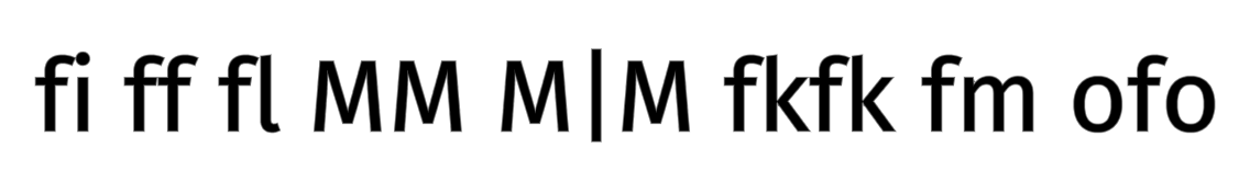
While looking at the text closely, also noticed another issue. The shadows of each letter overlap the previous letter. That's because I'm drawing one letter at a time. So for example in the fl, I draw the f's letter, outline, and shadow, then I draw l's letter, outline, and shadow. So l's shadow is drawn on top of f's letter.
To fix this I combined distance fields for a label. I first drew all the letters in a label onto a new texture. I used the blendEquation()[6]
function with MAX_EXT instead of the default FUNC_ADD. When I draw the letter f and also the letter l, the overlap will be assigned the higher value, which corresponds to the inside of the letter. The outline will have lower priority. The output texture holds a combined distance field. A secondary bonus is that when translucent outlines overlap, the old approach would draw them twice, but the new approach draws them once.
The MAX_EXT extension seems to have 100% support[7] in WebGL 1, and is always included with WebGL 2.
I then used the distance field shader to draw that combined distance field to the map.
Here's the result, showing that the inside of the letter takes priority over the outline, especially at the bottom left of the second g:


I could do this once per label or once for the entire map. I decided to do it once per label, because that allows me to use different colors and styles (thickness, outline width, shadow, halo) per label.
Creating a combined distance field for each label may be expensive. A cheaper implementation would be to use WebGL2's gl_FragDepth in the fragment shader (also available with the WebGL1 extension EXT_frag_depth which isn't supported on Android[8]). Write the distance as the depth, and then use depth testing to avoid writing the shadow on top of the text. As of Feb 2026 I have not yet tried this.
3 Curved text#
I wanted curved text. It's something I see on some maps. I worked out the math on paper first. I'm curving text by preserving the path length on the baseline when curving downwards and the ascender line when curving upwards. Here's an interactive widget showing how that works:
Here's a screenshot of the three cases:
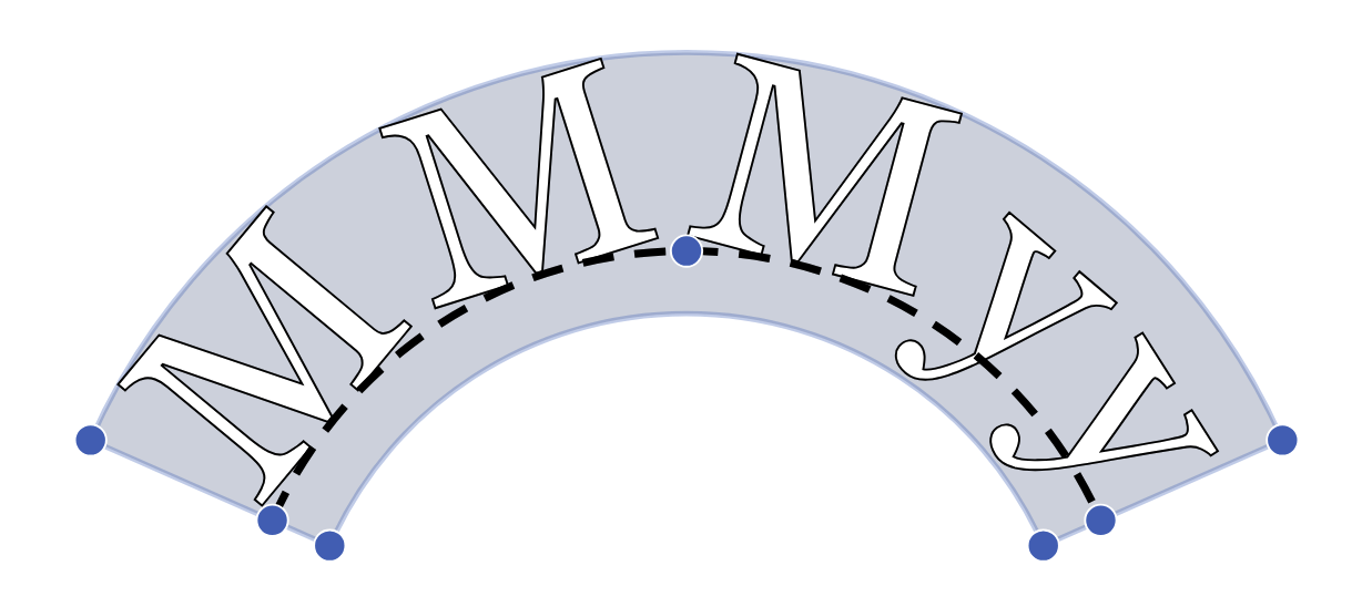
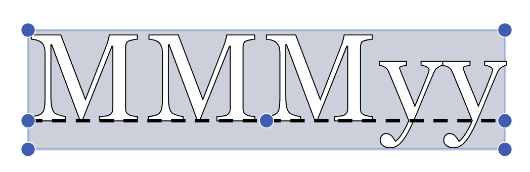
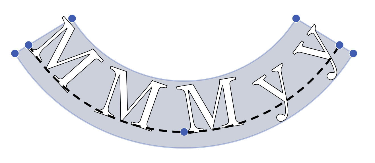
If I always curve at the baseline, the tops of the characters are too close together. That's why I have to curve at the ascender line instead of the baseline when the curvature is negative:
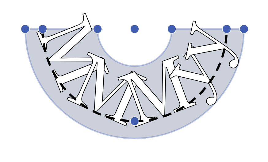
I'm implementing curved text by first rendering the letters to an uncurved rectangle, and then curving the rectangle ("warping"). The other way to implement it is to rotate and place the individual letters on a curved path ("wrapping"). The recommended way is wrapping (see Google's page[9]), because it doesn't lead to distortions like this:
But there's more flexibility in curving a rectangle, as I can get things like this (shaped suggested by Rich Gossweiler):
However, whenever stretching the label non-uniformly, the distance field gets distorted. In this example the white halo on the left side (The) is much larger vertically than horizontally:
I think the best solution is to regenerate the distance fields. But since I'm precalculating the distance fields, I don't want to do that. It might also be possible to use shader derivatives to adjust the halo to match the local distortion, like we do for antialiasing. However I don't want to figure that out right now, so I'm going to move on to other parts of this project. If I switch to the wrapping style, I won't need to solve this problem.
4 Positioning text#
One bug that too way too long to figure out was that I was positioning the text wrong. Only after several days did I find a good visual way to see that there was indeed a problem: the letters change the vertical alignment. Here are two separate strings rendered at y = 0. But they are aligned to the bottom padding, not to the text baseline. This was a surprise to me because I thought I was handling the baseline position correctly.
I found a way to make it work, but I don't fully understand why my fix works.

I will have to revisit it later to understand why this worked. A lot of the code is a mess, as I don't properly annotate variables with whether they're atlas texture coordinates, font coordinates, framebuffer normalized device coordinates, framebuffer texture coordinates, output rectangle coordinates, or output normalized device coordinates. And I think I had been using some values without converting coordinate systems.
5 Resolution of text#
How big should the intermediate sdf texture be? I initially matched the output label, but for small text that made it lose the distance field resolution, and then the output wasn't smooth. I then matched the input atlas, but for long labels it didn't fit, so the output got truncated. In this diagram pay attention to the shape of the ends of strokes while clicking the resolution number to see the difference:
resolution=
At this size, resolution 1 is too round but 2 is good, and there isn't much to gain past 2. At first I thought it was something do with the Nyquist Theorem[10], which states that we need to sample at twice the frequency of the input. However, for larger text, it does help to make it larger, especially where the two strokes of the r meet:
resolution=
So that means there must be another reason, not the Nyquist Theorem. I realized it's because my original font atlas uses MSDF (multi-channel signed distance fields), which can produce sharp corners[11] at small texture sizes. Regular SDF fonts have rounded corners at small texture sizes. When I combine the MSDF distance fields into the intermediate texture, it turns it into SDF and loses the MSDF sharpening ability. As far as I can tell, there isn't a way to produce a combined MSDF. So I have to compensate by making the intermediate texture larger.
For small text, scale 2 works nicely because it allows for longer labels, up to around 150 characters long with the current choice of font. For large text, the labels can't be too long (because they'll exceed the map size) so that allows me to use larger scales to make the corners sharper.
I decided to set it at 5 for now (maximum label 60 characters), but will have to revisit later, especially after I try serif fonts.
I later discovered that I had a bug that made everything off by a factor of 2, so I was really comparing 0.5, 1.0, 1.5, 2.5, 4.0. And 2.0 was actually pretty good. The bug was that I was measuring in normalized device coordinates that range from -1 to +1, but then comparing to texture coordinates that range from 0 to 1. That's a factor of 2 in my calculations. Oops.
6 Edit handles#
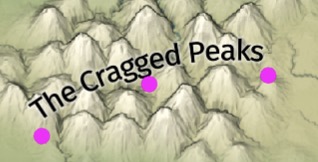
I have been using lots of sliders to control the various properties of the labels, but I thought it would be nice to control the common ones visually. I added three, one for spacing+curvature, one for position, and one for size+rotation:
I thought it'd be easy, and I'd have everything implemented in a few hours. It wasn't as easy as I thought. The first problem was that my code is a mess, and I have lots of different coordinate systems. Drawing the markers mean I need the position portion of the transform matrix but not the scale part. I didn't realize this at first, and was trying to use the transform matrix for everything.
The bigger problem is that it's unclear what movements should turn into. Position is simple. But rotating and resizing the text simultaneously didn't work so well. I don't want horizontal to be size and vertical to be rotation. That didn't feel right. I instead want radial movement to be font size and circular movement to be rotation. So I remembered a vector for each of the markers, and movement along that vector controlled font size and movement perpendicular to that vector controlled rotation.

But the vector can change while the dragging is happening! Initially I used the vector as calculated when the drag started, but that didn't feel right. So I changed to use the vector as the drag was happening, and I only applied the change since the last mouse position. That introduced a new bug.
Imagine a mouse drag from x = 0 to x = 100, taken in one large swipe. Maybe this changes the letter spacing from 0 to 25.
Now imagine that same mouse drag taken in 100 steps. Initially the letter spacing is 0. After one step, x = 1, the change in x is +1, and the letter spacing should be increased by +0.25. But the letter spacing is also tied to a slider which rounds the number to the nearest integer. So it sets it to 0. Then after another step, x = 2, the letter spacing is increased from 0 to 0.25 and then rounded back to 0. So if moving the mouse slowly, the value gets stuck at 0.
There are several possible fixes. One is to not round the value during a drag. But this doesn't entirely fix the problem, because the vector changing at each step means you still can get different results with one big update x += 100 vs a hundred separate updates x += 1. Another fix is to do everything in polar coordinates so that r and θ are independent. Another is to write a solver that tries to adjust the parameters iteratively until the marker position is close to the mouse pointer.
It's not at all obvious which one will work best, and I feel like I could get into another rabbit hole exploring this problem.
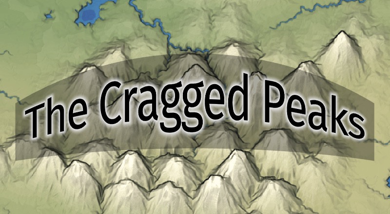
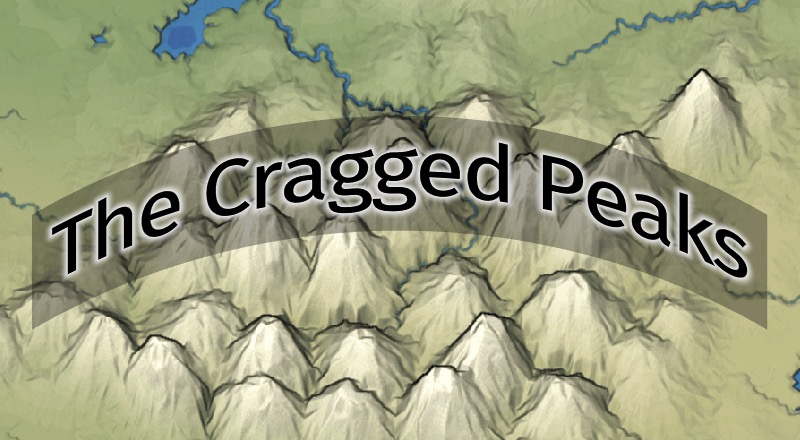
7 Halos#
The cartography community seems to use the word "halo" to mean outlines with extra effects:
- https://www.esri.com/arcgis-blog/products/product/mapping/can-you-read-me-now/[12] - shows examples of text on a busy map, and how they are mostly hard to read
- http://blog.gretchenpeterson.com/archives/2511[13] - says outlines help text contrast, but thick outlines look ugly, thin outlines aren't enough; suggests using a background color that matches the map
- https://nyalldawson.net/2017/04/about-label-halos/[14] - says thick outlines draw too much attention; suggests using a combination of blur and "darken" blend mode
- https://www.esri.com/arcgis-blog/products/arcgis-living-atlas/mapping/polishing-your-halo/[15] - shows thick outlines; suggests making them thinner, match the background image; add transparency; add blur
- https://shadedrelief.com/type-halos/[16] - says labels without outlines are hard to read; with outlines they look ugly; suggests blurring the background image
So these are my ingredients:
- outline
- blur the outline
- choose an outline color from the map
- blend in a non-standard way (darken/lighten)
- blur the map colors before blending
8 More#
Mapbox uses distance field fonts too[17]. They want rotated text on maps, and they also want text halos to increase contrast. Both of these work nicely with distance field fonts.
Source: map-typography.js