Here I have an unorganized collection of "little things" about my interactive diagram design. I am using this as a reference for myself, so that when I write a new page I can look through things I've done previously. I have previously listed a few of these in my interactive tutorial about how to make interactive tutorials[1].
1 Visuals#
1.1 Inline legend#
Text on the page might describe elements in a diagram. For example, I might write "the blue lines represent graph edges". For describing elements, we aren't limited to using text. We can draw those elements directly, like we do in hand-drawn notes. For example, I could write, "the blue lines represent graph edges".
<SVG> is an inline element, like <img>. It can be placed in the text of a document. Here are examples where I connect the text and diagram by including elements of the diagram in the text.
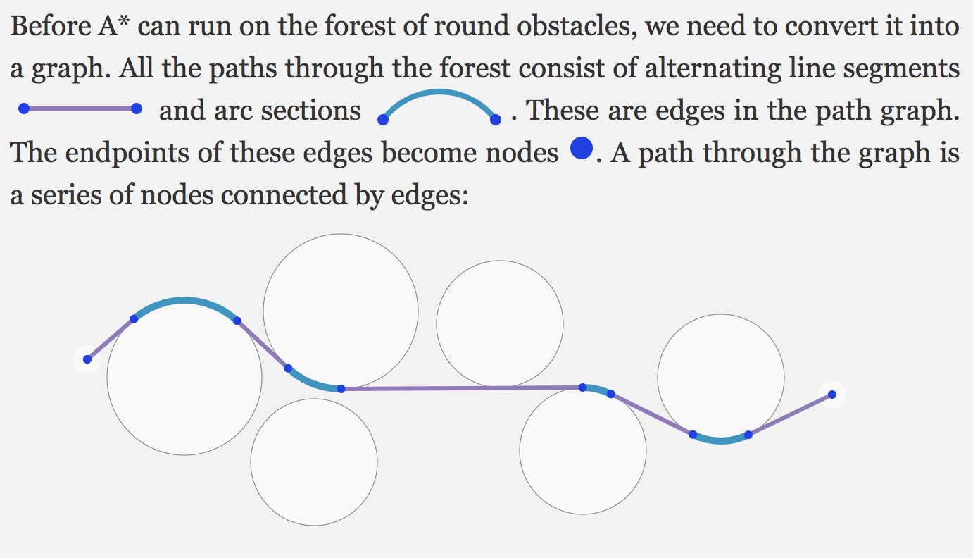
Use <svg width="3em" height="1em" viewBox="…"> to scale it to fit the text. The width and height are the size in the text and the view box is the coordinates of the diagram.
Related: sparklines[2] show data inline in the text. What I'm doing here is showing the legend inline in the text.
1.2 Color in diagrams match text#
I sometimes use colors in the text to match the color in the diagrams. Here's an example from the hexagon guide.
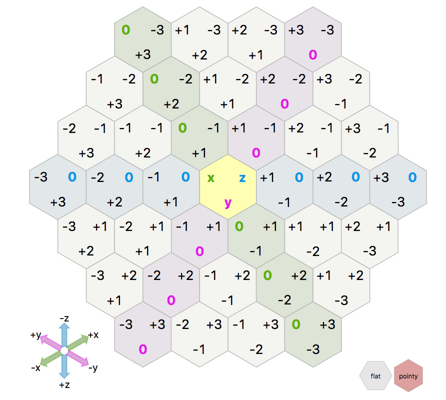
Unfortunately because the text is x, y, z, the colors are not easy to see. I think the colors on the pathfinding pages worked better.
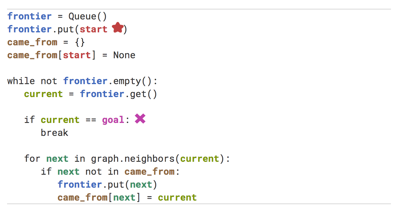
1.3 Color in diagrams match code#
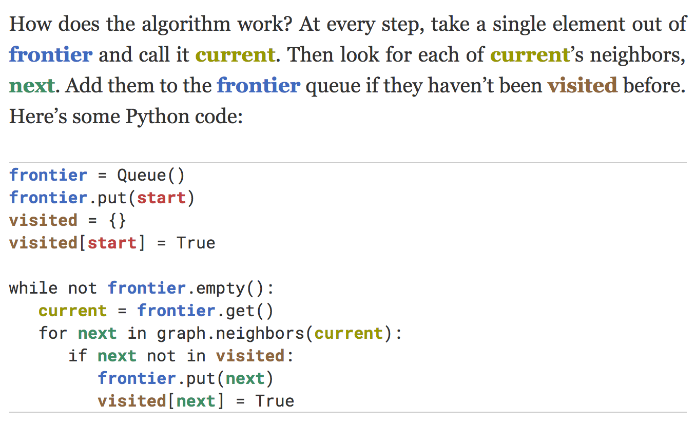
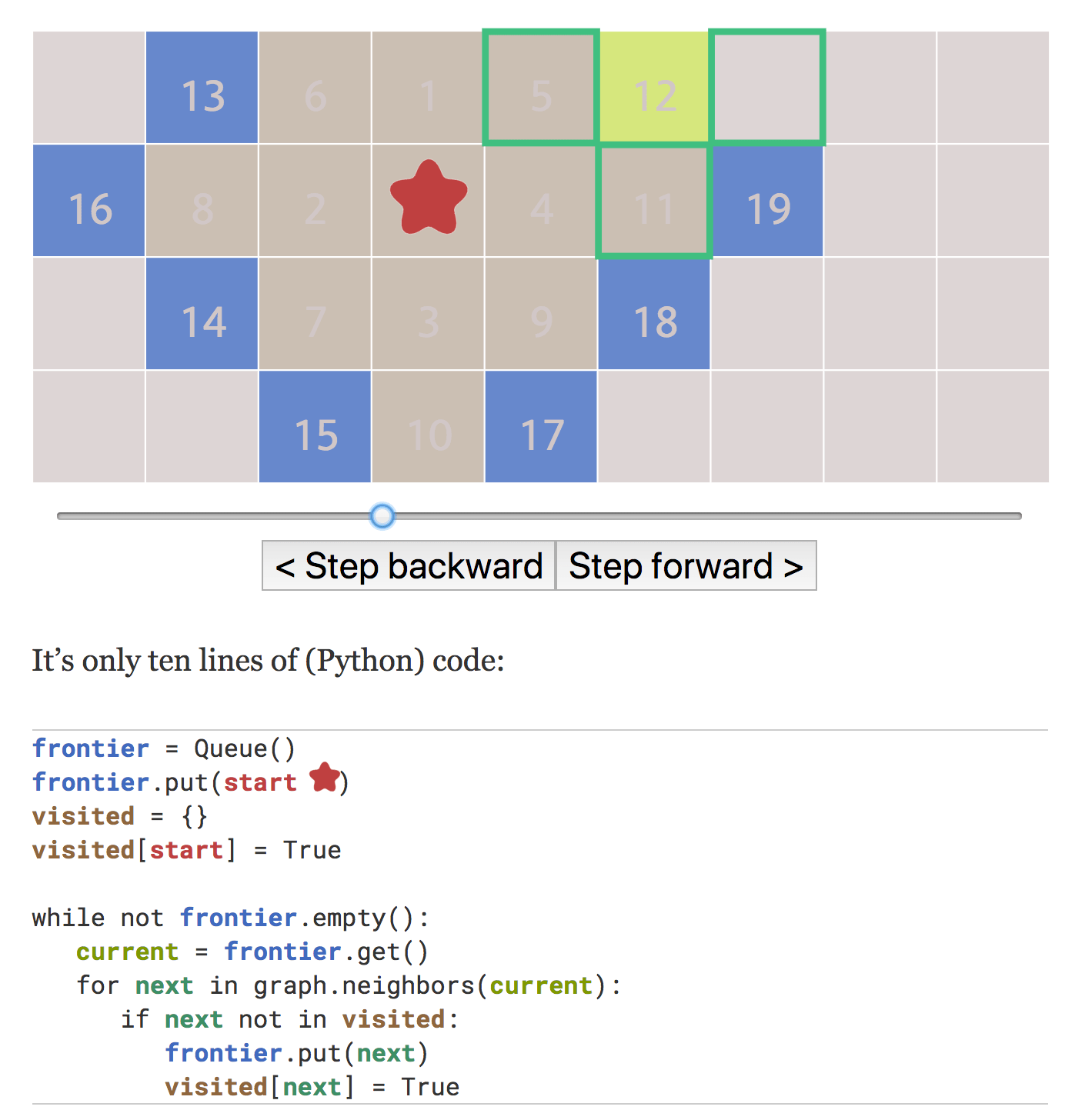
In this diagram on my breadth first search page, I use a red blob for a pathfinding node, blue for the set of nodes to be explored, green for the neighboring nodes, yellow for the current node, brown for visited nodes. In the code, instead of using standard colorizations for strings, keywords, etc., I use the same colors that I used in the diagram. I use the same colors in the text.
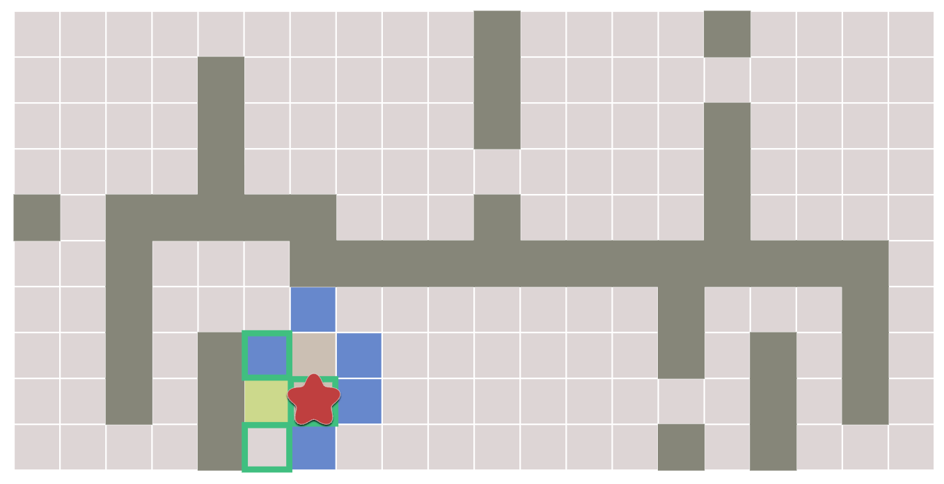
I think I used too many colors. It would have been better to break this up into several steps, each focusing on one concept. In each step, I would use color only for the one concept I am trying to explain. Alternatively, this visualization[3] shows all the colors, and then hides all but the one concept the reader is focusing on.
I use both color and icons sometimes:
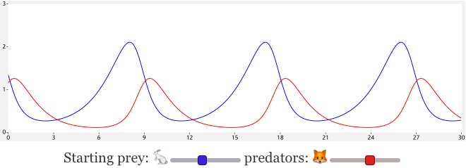
Here I colored the controls that correspond to the lines on the chart:
Related:
- Evan Brooks's article about semantic coloring of code[4]
- Oleksandr Kaleniuk's article about using color to mark identifiers that look similar[5].
- My experiments with equation formatting
- My experiment coloring code in my editor[6]
1.4 Negative space#
Negative space[7] is the space around the thing we draw. We can use this to our advantage, creating shapes in the mind without actually drawing them. A common example of this for page design is avoid drawing borders. We can often get the same effect by using background colors and leaving some space:
Sidebar sidebar sidebar
I guess I'm a little weird. I like to talk to trees and animals. That's okay though; I have more fun than most people. Let's do that again. There we are. Let's get wild today.
You can do anything here - the only pre-requisite is that it makes you happy. The light is your friend. Preserve it. Maybe there was an old trapper that lived out here and maybe one day he went to check his beaver traps, and maybe he fell into the river and drowned. We don't have to be concerned about it. We just have to let it fall where it will.
— Bob Ross text generator[8]
The first style focuses on the border; the second style focuses on the content.
I use the same idea for diagrams. It's especially noticeable with grids:
The first style emphasizes the edges (which is what I want on a page about edges); the second style emphasizes the tiles (which is what I want most of the time). It's not always practical though in some color schemes.
I occasionally use this with node-and-edge graphs:
The first one emphasizes the edges and the the second one emphasizes the nodes. Which works better depends on which I want the reader to focus on.
1.5 Yellow light and blue shadows#
I had read somewhere that artists use yellowish tints for sunlight and bluish tints for shadows. I used this idea for my 2D visibility page:
I don't know a lot about this though, and haven't used this idea much. I think what's going on is that light from sun+sky is white, and shadows have only the sky component but not the sun component so it's a bit bluish. Also see: The Muller Formula[9], which says lighter colors should be hue shifted towards yellow and darker colors should be hue shifted towards violet. [However, Jacob Rus says it's bogus[10]]
1.6 Custom controls#
Web pages as documents have links that navigate to another page. Web pages as "apps" have that perform actions. My pages tend to have a few controls that don't quite match either of these.
- I strongly prefer browser controls with styling than to build my own control. The problem with my own controls is that they don't follow platform conventions and are less accessible. For example, Discord has its own custom input box which supports arrow keys like ← and → for moving the cursor. But they don't fully support the Mac's alternate arrow keys Ctrl+B and Ctrl+F for moving the cursor (these are useful on keyboards without arrow keys or where arrow keys are inconvenient). By implementing their own key handler, they ended up missing the keys I use the most, which is quite frustrating.
- On my A* page I have some places where I want mouse hover or touch hold down to display an alternate view. I'm currently using a button for these, but I think they may be better displayed as an alternate type of link like show alternative.
- On my hexagon guide I have some places where I want mouse click or touch tap to toggle the state of a diagram. I'm currently using a button like for these.
- Distill.pub in their Visualizing memorization[11] article has some places where they want a mouse click or touch tap to change the state of a diagram. They're currently using links like removing the last two letters and only the first two characters as input for these.
- On the line drawing page I have some scrubbable (draggable) numbers. I ended up styling it like this: 47.
- I've experimented with using html5 number (<input type=number>) but then attaching styling and mouse event handlers to it so that it works as a scrubbable number normally, but if you click on it, it acts like a regular number control that you can type into. See this page about coordinate systems. Also see the
:invalidand:out-of-rangeCSS selectors that can be used to style typed-in values that are out of range. - This React component[12] uses <input type=text> instead of type=number, allowing for text input, but keeps an internal value to support partially typed values.
- Bret Victor's Tangle library[13] has scrubbable numbers using a link-like format 47 that shows instructions when you mouse over it.
- On my probability page I use a style similar to Tangle, but without instructions.
- Jeremy Apthorp's editor[14] also uses a style similar to Tangle, without the instructions.
- On my beta distribution page, I use mouse hover and touch drag to explore the parameter space. This is a custom control. I would like to use standard html controls when possible, since they should be better for accessibility.
- On my visibility page, I use an html5 slider (<input type=range>), but I style it to be bigger and easier to control when viewed on a phone.
- Stanko Tadić has a dual range slider[15] that uses existing two <input type=range> sliders next to each other
- Yuri Vishnevsky has a three-way slider[16], which is something I've wanted for some projects
I'm clearly not consistent across pages. I think I should spend more time looking at what controls other interactive pages use, and see if I can be more consistent with them.
1.7 Arrows#
I like arrows. I like arrows a lot.
With static diagrams it's fairly easy to figure out where to put arrows. With interactive diagrams we need to calculate the arrow placement. Alexander Wang has a great reference page[17] on this topic, and has a Javascript library called curved-arrows[18] (0.85 kbytes[19] gzipped+minified). Steve Ruiz has some notes on arrows[20] too, and also has a Javascript library called perfect-arrows[21] (2.6 kbytes[22] gzipped+minified).
Arrows are a little bit easier to implement in SVG than in Canvas.
1.7.1. SVG#
In SVG, you have to create a marker inside <defs>, like this (my version modified slightly from the docs[23]):
<defs>
  <marker id="arrowhead" viewBox="0 0 10 10"
          refX="7" refY="5" markerUnits="strokeWidth"
          markerWidth="4" markerHeight="3" orient="auto">
    <path d="M 0 0 L 10 5 L 0 10 z"/>
  </marker>
</defs>
Then you can annotate any line/path with the marker, like <path d="M 20,10 l 10,80" marker-end="url(#arrowhead)" fill="none" stroke="black"/>. Let's see what it looks like:
      <path d="M 20,10 l 10,80" />
      <path d="M 60,70 a 100,-30 0,0,0 100,0" />
      <path d="M 210,40 c 50,20 -30,30 0,50 " />
      <path d="M 270,70 c 0,-100 -100,-30 -200,-50 " />
There are a few tricky things with SVG arrows.
The marker contains the color. It's the fill color in the marker that draws the arrowhead, whereas it's the stroke color in the path that draws the tail. This has long been recognized as a problem, as seen in this discussion[24] suggesting that there might be a solution in svg 2. Also see this article[25] about styling <use> elements, although I don't think that solves the problem with arrowheads, because we both need fill to be none on the arrow and fill to be non-none on the arrowhead. Workaround: generate a new marker for each color :-( (Firefox has support for this SVG 2 feature but Chrome does not, so I don't use it)
    <path fill="none" stroke="red" marker-end="url(#arrowhead)"
       d="M 20,10 l 260,10" />
The id is unique per page. If you have multiple <svg> elements, the id has to be unique across all of them. It's not per svg. Workaround: generate a new id for each svg :-( if you need them to be different in each diagram.
To apply alpha, use opacity instead of fill-opacity! See this stackoverflow answer[26].
1.7.2. Canvas#
I wrote this function a long time ago, for Flash, and have continued using and tweaking it with my Canvas-based projects.
function lerp(a, b, t) { return a * (1-t) + b * t; }

function drawArrow(ctx, tail, head) {
    const stemLength = 0.5;
    const headLength = 0.5;
    const stemWidth = 0.15;
    const headWidth = 0.4;
    const tailLength = 0.1;

    let sx = lerp(tail[0], head[0], 0.2);
    let sy = lerp(tail[1], head[1], 0.2);
    let dx = (head[0] - tail[0]) * 0.7;
    let dy = (head[1] - tail[1]) * 0.7;

    ctx.beginPath();
    ctx.moveTo(sx + dx*tailLength, sy + dy*tailLength);
    ctx.lineTo(sx - dy*stemWidth, sy + dx*stemWidth);
    ctx.lineTo(sx + dx*stemLength - dy*stemWidth, sy + dy*stemLength + dx*stemWidth);
    ctx.lineTo(sx + dx*(1-headLength) - dy*headWidth, sy + dy*(1-headLength) + dx*headWidth);
    ctx.lineTo(sx + dx, sy + dy);
    ctx.lineTo(sx + dx*(1-headLength) + dy*headWidth, sy + dy*(1-headLength) - dx*headWidth);
    ctx.lineTo(sx + dx*stemLength + dy*stemWidth, sy + dy*stemLength - dx*stemWidth);
    ctx.lineTo(sx + dy*stemWidth, sy - dx*stemWidth);
    ctx.lineTo(sx + dx*tailLength, sy + dy*tailLength);
    ctx.fill();
}
It doesn't support curved paths like the SVG version, but it also doesn't have the fill vs stroke color problem like the SVG version.
1.7.3. Across elements#
It turns out SVG elements default to overflow: hidden but you can change that CSS to overflow: visible to let the SVG exceed the containing box. I've written about this elsewhere on this page. The most unusual thing I've done with it is to have arrows extend far outside the <svg>. I haven't used this much, but here are some demos:
I haven't written a full tutorial on this topic but you can look at my implementation, interior-arrow.js. I also found leader-line[28], a library that implements arrows like this (it also has a vue wrapper[29]).
2 Interactivity#
2.1 Interaction feedback#
These effects and others can be combined. Also the drag and hover effects can be different. For example, set the mouse pointer and fill color on hover, and then add a drop shadow and slight rotation on drag. Try dragging this shape:
2.2 Drag point#
The simplest way to deal with dragging is to set the object's position to the mouse position. This works fine for small shapes but it has a problem that's noticeable with larger shapes. Suppose we pick up the square from its corner and drag to the right. What should happen? If setting the square's position to the mouse position, it will "snap" down and to the right. Instead, we should remember where on the square we're dragging from, and position the square relative to that.
Try it yourself:
What does the code look like?
- When starting a drag operation, remember the offset between the object position and the mouse position. offset = {dx: pos.x - event.x, dy: pos.y - event.y};
- When dragging, add the offset to the mouse position to get the object's position. pos.x = event.x + offset.dx; pos.y = event.y + offset.dy;
There are other equivalent ways to implement this, and which way is easiest will depend on the API and what else I'm doing with the mouse coordinates. When I'm using d3, d3-drag[30] supports this feature by setting the "subject" for the drag operation.
A different approach is each time mousemove is called, increment the object's position by the change in mouse position. In some browsers, mousemoveX, mousemoveY contain the change, and they continue to work even if the mouse is taken off screen (using Pointer Lock). I prefer using the absolute change since the drag started instead of relative position since the last mousemove. It allows constrained / snap-to-object movement as I explore on this page, and as you can see in the demo above.
Also see Peter Collingridge's interactive explanation[31] (2012, before pointerevents but same concepts apply).
2.3 Expanded hit area#
The previous section was about dragging something large. We have a different problem when dragging something small. With some input devices, it's hard to be precise enough to point to a small object. Even if I am able to point to it, the act of clicking will move my pointer slightly for some types of input, and that causes me to miss. Even when I do grab it, the mouse pointer or my finger can hide the object.
On the left is the regular object drag approach. On the right:
- An invisible draggable area is underneath the circle, to make it easier to pick up the cricle.
- The cursor goes away while dragging so that I can see the object being dragged. (Implementation could be better.) (Alternatively, use the
crosshaircursor[32].)
How do I implement this with SVG? I usually make the invisible area draggable, and it updates an underlying position object. I then draw a non-draggable object on top of it at that same position. The next problem is that the non-draggable object eats up the mouse events before the invisible area receives them. Solution:
.draggable { cursor: grab; pointer-events: all; }
.object { pointer-events: none; }
Now SVG will not pass pointer events to the visible object on top, and only pass them to the invisible object underneath. The pointer-events[33] CSS property is quite useful here!
When using Canvas or WebGL, I can't use invisible SVG objects so I have to reimplement all of this. Either go through all your objects and find something close enough to the mouse pointer, or use Voronoi to build to build a map of which object is closest the mouse pointer. The Voronoi approach is used in the D3 community[34], in part because D3 comes with a nice Voronoi library.
2.4 Z-index#
If there are multiple things that can be dragged, it's possible that the item being dragged gets drawn under another item. Ideally we'd be able to set the z-index temporarily on the dragged item but SVG doesn't support z-index. The drawing order depends on the order in which the elements occur in the SVG.
That means we would need to temporarily reorder the SVG elements. Unfortunately, reordering currently means removing and re-adding the element, which loses focus, pointer capture, and event handlers.
If you're managing the DOM nodes yourself, at pointerdown time you can move the element to the front and then apply pointer capture, and re-attach the event handlers. Then on pointerup, move the node back, and re-attach the event handlers.
Libraries such as React and Vue will use the remove and re-add approach, so they lose the pointer capture. In Vue, use nextTick() to apply pointer capture. That will allow you to reorder the nodes once. It won't work if you reorder during the drag, such as when using multiple fingers to drag different objects.
There's been talk since 2018[35] (and maybe earlier) of adding an API to move DOM nodes. As of 2025, Firefox and Chrome have moveBefore(), but, it's not part of Interop 2026[36] so that means it has a lower priority for making consistent across browsers. Once we get this API, I think it'll be easier to make sure dragged elements are drawn above other elements.
2.5 Transitions#
The main reason I would use a transition is because I want to show the states in between two states the reader is looking at. Most of the time, the in-between states are automatically visible as the reader moves a slider or other control between one state and another. If I can redraw the diagram quickly enough, I don't need to add transitions or animations in those situations. Transitions are useful when switching between states where the slider/control doesn't go through the intermediate states. An example is the two orientations of hexagonal grids, "flat topped" and "pointy topped". Compare without and with transitions:
On the left, you can see the two orientations but it's hard to see that they're related. The transition on the right diagram shows the connection between the two grid types.
- An example where the slider goes through the intermediate states already: probability of damage rolls. Try changing the numbers in the
rollDice()call. Transitions might help a little bit but not much. - An example of discrete states: cubes and hexagons. There's a toggle button, which has no intermediate states. I admit I went overboard with the animation but I think it makes it memorable.
- An example on the same page is the map storage diagram; try switching the data structure using the button underneath. The transition shows how the two data structures are related.
I think the default transitions in CSS and d3 are pretty good, but for the hexagon page I added a slight overshoot, like easeInOutBack[37] but subtle.
2.6 Comparisons#
It's been observed that it's harder to assign a 1-5 star rating to something than to say whether one thing is better or worse than another. I first ran across this in the 1990s and kept noticing it after that. For visualizations, I find it's often hard to evaluate something on its own, but it's easier to see when it's next to something else.
I use this on my A* page, for:
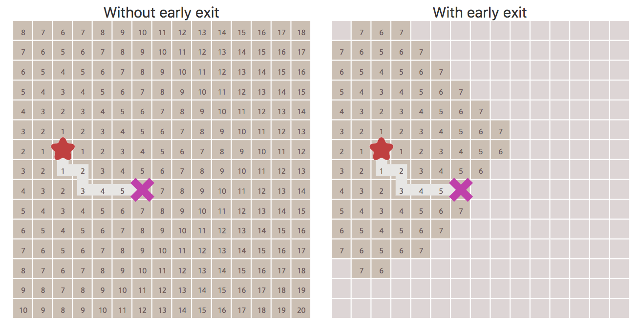
- comparing early exit to full exploration
- comparing fewest number of steps (Breadth First) to shortest path (Dijsktra's)
- comparing uninformed search (Breadth First) to heuristic search (Greedy Best First)
- comparing Dijkstra's, Greedy Best First, and A*
I also use this on my hexagon page, for:
It's often better to show all the variants than to ask the reader to interact with the diagram to see the variants. Interactivity isn't always needed. Related: Ladder of Abstraction[38]
2.7 Touch events#
I'd love to write everything for desktop browsers and not worry about mobile, but the reality is that “desktop” and “mobile” are not great categories. Instead, I have:
- Output
- narrow, wide, small, large, portrait, landscape, even print — lots of variety! I use responsive design for this, including switching between two and one column layout on some pages.
- Input
- mouse, trackball, trackpad, touch.
I first design pages for mouse/trackball input. This means: left-click, left-drag, right-click, right-drag, hover. However, given how many trackpads there are, these days I limit myself to left-click, left-drag, hover.
- Decide what action the touch event should perform. On some pages this is touch-down/touch-up but on other pages I have touch-down/touch-up perform the same action as mouse-drag. It's something I think about separately on each page, and sometimes on each diagram.
- Consider additional functions like multi-drag, pinch, zoom, etc.. These work on touch devices and also on trackpads. I haven't used these yet.
- Be careful about how touch-drag interacts with scrolling. Typically I'll capture the touch-drag and stop scrolling, but that means if you're rapidly scrolling down the page, you might get trapped on a diagram. I don't have a good solution for this.
- Think about what information is covered up by the finger during interactions. On many pages I've moved sliders and buttons below the diagram so that when you're interacting with it, your finger/hand don't cover up the diagram.
For the implementation, I use pointer events as much as I can, but sometimes have to use touch events also.
2.8 Sliders#
Especially for debugging and tweaking, it's useful to attach a slider to some value. I think dat.gui[39] is a common choice, but these days html5 makes it easy to make your own in 30 lines of code. Demo (use View Source to see the code). I wanted to be able to use global sliders like this:
// Add slider - current value, min, max, number of digits
slider('velocity', 0, -5, 5, 4)
slider('num_sides', 2, 0, 5)

// Read the slider value like an ordinary field
for (let i = 0; i < slider.num_sides; i++) { }

// Set the slider value like an ordinary field
slider.velocity = 1.7321
Variants: a callback function that gets called whenever any or a specific slider changes; a user-visible label separate from the property name; make the url parameters match the sliders; store the value in an external object instead of inside slider. Since I copy these 30 lines into a project, I can easy modify it to match my needs instead of making a more complicated reusable library that supports all features.
2.9 SVG outside its container#
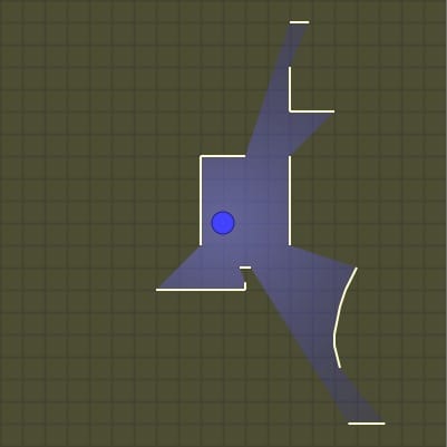
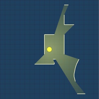
By default, <svg> elements clip the content to their container. This can be changed! By default, SVG uses overflow: hidden[40]. Compare:
Try dragging the green circle to see how it feels different with and without the walls.
I discovered this feature many years ago (probably 2011) when I was testing in Internet Explorer, which used to use overflow: visible as the default, whereas Firefox used overflow: hidden as the default. At first I was annoyed that Internet Explorer was different, but then I realized, maybe its behavior is useful! I have experimented a little bit over the years:
- A demo exploring how text can point inside diagrams[41]
- A page about dungeon generation algorithms
- An abandoned project showing how two diagrams are related
- A tutorial in which you can drag the circles outside the diagrams[42]
- A visualization showing animated dots flying between two diagrams[43]
Note that some browsers won't catch input events outside the boundary.
2.10 Detect bad input#
When making static diagrams, we can pick good illustrative examples. With the interactive diagrams, sometimes the reader will end up in a bad or unhandled state. Ideally, I'll design the controls so that the bad states aren't reachable. But if I can't do that, I try to detect the bad states and alert the reader. For an example of this, see the 2D visibility page. Move the squares so they overlap. It'll highlight the conflict in red because the algorithm doesn't handle overlapping lines.
2.11 State machines#
It's often useful to express the interaction state with a state machine, so that you can make sure every transition is handled. For example, even a simple thing like a button might have seven states, as shown in this interactive demo[44].
2.12 Canvas + SVG overlaid#
Sometimes I want to use both Canvas and SVG for the same diagram. SVG provides easy interactive elements; Canvas provides better performance and image handling. In these situations I will put an SVG over a Canvas:
<div style="position:relative">
  <canvas style="position:absolute;z-index:0" width="800" height="800"/>
  <svg style="position:relative;z-index:1" viewBox="0 0 800 800"/>
</div>
I've been using this technique less often these days, but I think CSS Grid would be a reasonable way to implement it too.
2.13 Continuity#
One problem I run into is that an algorithm that calculates f(x) is fine in production, but in an interactive setting, it needs to be continuous with respect to x. That way, as you manipulate x you can see how it affects the output f(x).
With pathfinding, this showed up when there are many ties for paths on the map. Each time I ran pathfinding, it might pick a different one. This is fine for a normal implementation, but for the interactive diagram, it was distracting to see the path "flicker" as you changed some unrelated parameter.
I also had this happen with map generation. Minor changes to some parameter wold cause the generated rivers to be in completely different places. I had to switch the interactive version to use a slower deterministic algorithm so that it wouldn't flicker.
2.14 Islands of interactivity#
I generally design my pages to be mostly static, with sections of the page being interactive. Each section is usually its own separate interactive section that doesn't interact with the rest of the page. Part of the reason for this is that if the reader is interacting with one section of the page, they're not able to see the other sections, so I don't want any "spooky action at a distance". But ideally my pages will work as static pages without needing any interactivity, and I've made some of my pages work without Javascript enabled.
Also see https://www.patterns.dev/posts/islands-architecture/[45] and https://www.patterns.dev/posts/import-on-interaction/[46]
3 General design#
3.1 Color & size#
Use brighter (saturated) colors for important things, but in small areas only. If it's large then it makes everything seem unimportant.
3.2 HSL colors#
When picking colors, the default is to use RGB. It's well known and widely supported. Web browsers also support HSL colors. I find these much easier to work with. The standard colors are easy to switch to HSL:
Setting saturation to half (S=50%) results in colors I like better:
With RGB, we replaced 0→64, 255→191. With HSL we had to change S from 100% to 50%. HSL's advantage shows up when I want to go beyond these. For example, changing hue:
or saturation:
or lightness:
I find it much easier to work with HSL than RGB. I can pick sets of colors that match each other. HSL is supported for SVG, HTML, and Canvas vector drawing, but not WebGL or Canvas pixel manipulation. HSL has some flaws, but since it's widely supported there's no real downside compared to RGB. For a better color space, consider Oklab[47].
This is a nice article about picking colors[48].
3.3 Text shadow on header text#
I used this trick on Circular Obstacle Pathfinding[49]: add a black text shadow around white text to increase its contrast a little bit. There's not a lot to do if your colors are black and white, but a dark gray or light gray offer more options.
I've mostly used this for the headers, where the fonts are big enough for the text-shadow to work. I think it doesn't work as well for dark text on a light background.
Related: Lanczos sharpening filter[50].
3.4 Two column layout#
Some of my pages switch from one column on narrower screens to two columns on wider screens. Try them:
If you make the browser narrow it will shrink the two columns and then become one column, then shrink the text as you keep narrowing it.
I wrote a page with interactive diagrams that shows how the column size varies based on the browser width, and what CSS I used to implement it. Mouse over the diagrams to see the layout at that size.
The next challenge is the ordering of content. I wrote a blog post about ordering[51]. When A + B are side by side, and then I change to a one column layout, it's usually A then B. But if it's A+C and B side by side, and then I change to a one column layout, it's sometimes A then B then C, not A then C then B.
The CSS to change the layout when it's wide is easy. But writing the content to be balanced between columns and also reorder nicely is a lot of work. As mobile browsing has increased, I've focused on one column layouts, except for pages that will get a lot of views, where the extra work to make two columns might be worth it.
4 Site#
4.1 Longevity#
One of my biggest frustrations on the web is following a link to something that would be useful, except the page is gone.
- the domain wasn't renewed
- the web server is down
- the site is redesigned, and all the old pages are removed
- the site is redesigned, and the old pages are up at different urls
I try to follow an old piece of advice: "Cool URIs don't change" — from W3C[52]. If I'm going to rewrite something, I'll keep the old page up until the new page is ready, and sometimes even after that. I think it's a big mistake to erase everything first and because you're planning a redesign. Redesign it in a separate place, and then swap it in when it's ready.
Chasing virality is a trap[53]. It's fun to focus on the new & fresh, but I think most of the value comes from the long term. And that means a page that's several years old is still valuable. Not only do I want to keep those pages up, I also want to update them. I now treat my site like a wiki rather than a blog — I'll update pages as I learn more.
I think a lot of my site's success is because I keep my pages up. There have been lots of great sites over the years and almost all of them are gone now.
4.2 Links to sections#
On reference pages especially, I make each section linkable. It's an extra step though so sometimes I forget. My site template turns these into clickable # markers on the right side of each section header. I'm not especially happy with how the markers look, but I'd rather have something than nothing, so I put them up and can improve them later.
4.3 Reduce build steps#
Modern web develop has a lot of neat tech — webpack, gulp, rollup, vite, elm, react, nuxt, astro, clojurescript, svelte, etc. As longevity is important to me, I want to not only still have my pages working in ten or twenty years, I want to be able to update them too. So I evaluate every piece of tech not only in how much time it might save me now but also how much time it might cost me later.
One of the biggest problems I've found in maintaining projects from ten or twenty years ago is that the build tools no longer work. Will today's build tools work in ten years? If not, that's more work for me later. For most of my pages I don't use a build step at all. When I do use a build step, I'm using esbuild, as it seems like the simplest and fastest tool. I also use Vue. I'm not the only one; Julia Evans describes picking tech to minimize build steps[54]. And Svelte is trying to minimize build time by switching from TypeScript to JavaScript[55].
I think most people don't work this way. They work on a project, they launch it, they might update it for a little while, but then it never gets updated again. So my choice of technologies is a little different from most people. I often make my own tools, which is great for me by myself, but makes it harder to share things.
4.4 Add build steps#
In the previous section I mentioned how I try to reduce the build steps not only because it slows down development but it lets me maintain pages for decades. But what about build steps that are fast and are under my control, so that they will still work in ten or twenty years? I've added some of these.
It's easier to write prose in markdown than in html, and many static site generators let you do this. I've used markdown for some pages but I found it doesn't give me enough control, especially for interactive content. I've switched to org-mode, which is part of emacs. But for many of my pages I don't even use org-mode, because it doesn't give me full control. I write xhtml directly.
To keep the entire site consistent in look & feel, I use xsltproc to process the xhtml into html, adding the header, logo, footer, comment section, etc. This has evolved over time and is a mess but it's a manageable mess. The xhtml has extra tags that I use to trigger xslt rules.
I have my emacs trigger the page build when I save the file. I try to keep this step fast so that I don't notice the build time.
I further modify the html output to improve load times. I modify the resource urls to include timestamps, to improve cachability, and I also modify the image tags to include image sizes, to improve initial layout.
So that means the individual pages are org-mode → xhtml → html → html, and the site as a whole is building the individual pages but also checking for broken links and building a site map for search engines. It's all custom code that I keep updating over time.
All of this limits the ability for other people to contribute to my pages, but that's not a priority for me.
4.5 Freedom to experiment#
Around 2015 I ran into a problem where my expectations for my pages were too high. This made it really hard to start on something new. I would make grand plans but never get anywhere. I decided to make a separate folder (called x) where I can put experimental projects. This worked really well! I made a lot more things this way. If something works out, I can move it out of that folder and turn it into a full project.
My regular projects are fixed scope, variable time. My x projects are fixed time, variable scope. I'll try to end them after one week. This helps me avoid going too deep into a rabbit hole.
Even though it helped "unblock" me, I found that it's so easy to make a new x project that I work on lots of small projects and not many big projects now. This is a downside I hadn't anticipated and don't know what to do about.
4.6 Prerendering#
The hexagons page has a lot of diagrams. To improve load time, I prerendered all the diagrams so that when you load the page, you get 600k of svg instead of javascript that has to generate the svg. This (surprisingly) improved layout speed and perceived load time. And it also means that the page works if you don't have javascript, or if you want to print it.
However, it was all a hack. At the page level, I wrote some hacks that reused Vue's pre-rendering support, without using Vue's official solution. And at the site level, I had lots of special cases for how the site should be built. And at the machine level, I was using Chrome's --headless --disable-gpu --dump-dom which mostly worked but sometimes failed.
Even though I liked the results, the hackery made me unhappy and I took it out in <2022-09>.
4.7 Printing#
I sometimes get requests for a printable version of one of my pages. I've decided not to make a separate printable version. Instead, I've attempted to make pages printer friendly in a generic way:
- when feasible, start a diagram in a "useful" state that doesn't require interaction to learn from it
- when printing, annotate all links with a footnote, and then add footnotes with the urls
- when printing, add a qr code to the page header so that you can get back to the original version of the page
I wrote up the implementation details on my blog[56].
4.8 OpenGraph meta tags#
When I'm sharing on Twitter I'll attach images or a gif to the post. But when other people tweet my urls, it will use the images they attach, and if they don't attach an image, then it will fall back to meta tags to look for an image. So if I include those meta tags, I can attach a default image to be included.
- On Twitter, the Twitter Cards[57] add extra information when people link to your page (thumbnail, description, etc.). Use the https://cards-dev.twitter.com/validator[58] to test.
- OpenGraph tags are used by Twitter, Facebook, Slack, and others. Slack has a post about this "unfurling" process[59].
I am tags like these, mostly preferring the OpenGraph ones but using some Twitter ones:
<meta name="twitter:card" content="summary" />
<meta name="twitter:site" content="@redblobgames" />
<meta name="og:url" content="http://www.redblobgames.com/making-of/line-drawing/" />
<meta name="og:title" content="Making of: Line drawing tutorial" />
<meta name="og:description" content="Interactive tutorial about making interactive tutorials" />
<meta name="og:image" content="http://www.redblobgames.com/making-of/line-drawing/blog/image3.png" />
I've only done this on my more popular pages. Most of my pages don't get linked to often so they're a lower priority for me.